Modeling & Materials

Weekly Activity Template

Ran Ji This project is to explore the material and terrain in different school areas to learn about their properties and characteristics.


Module 2


PLACEHOLDER TEXT, put a description here or you will lose grades

Design Challenge 1
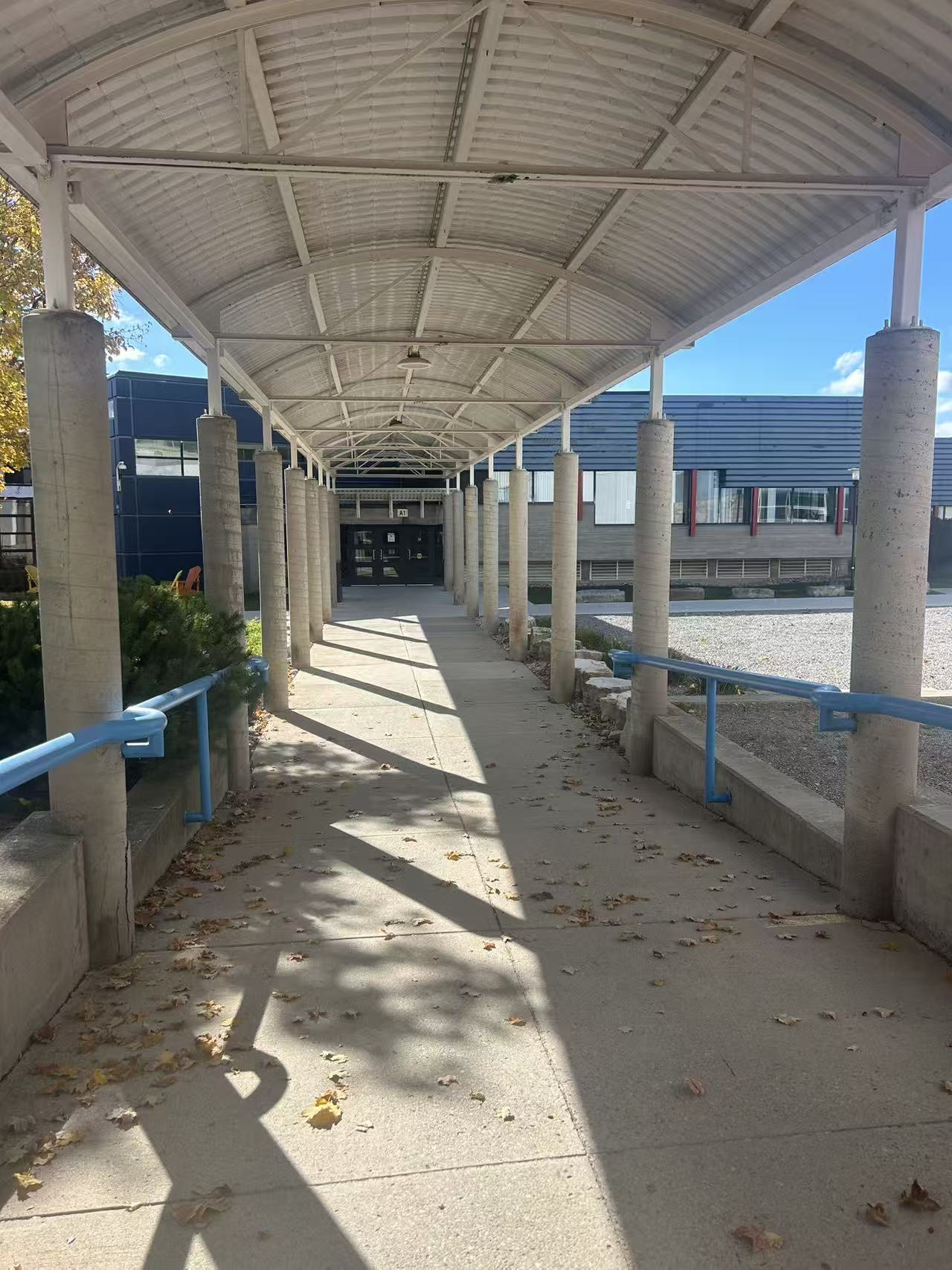
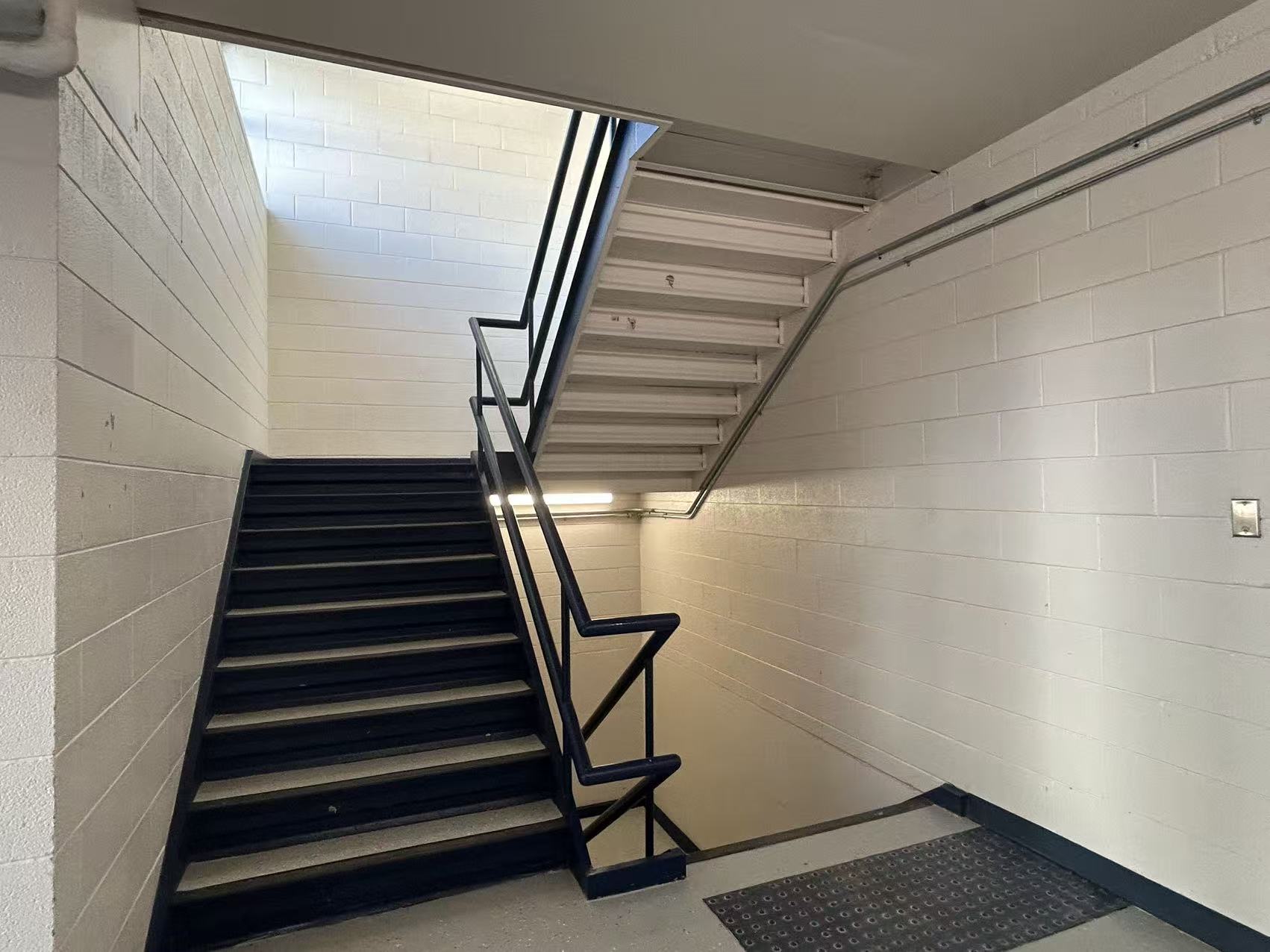
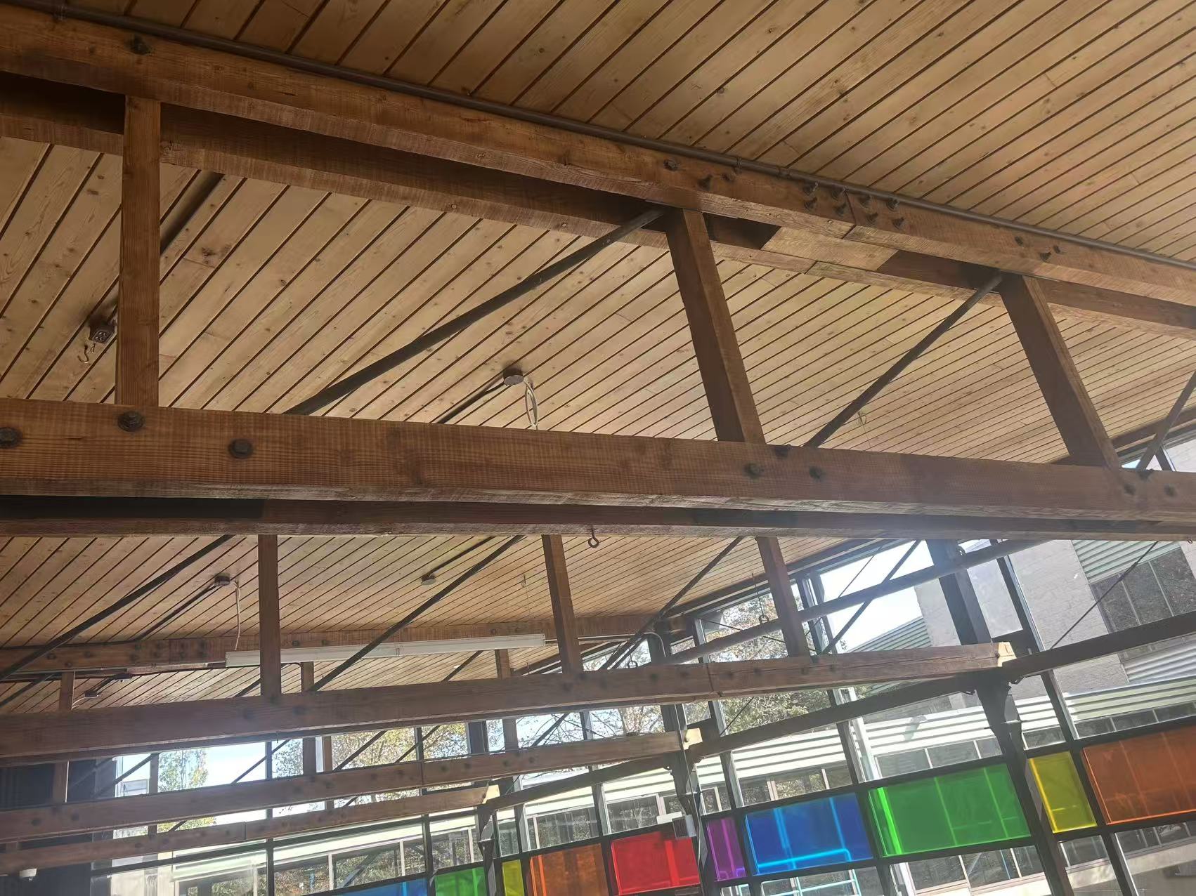
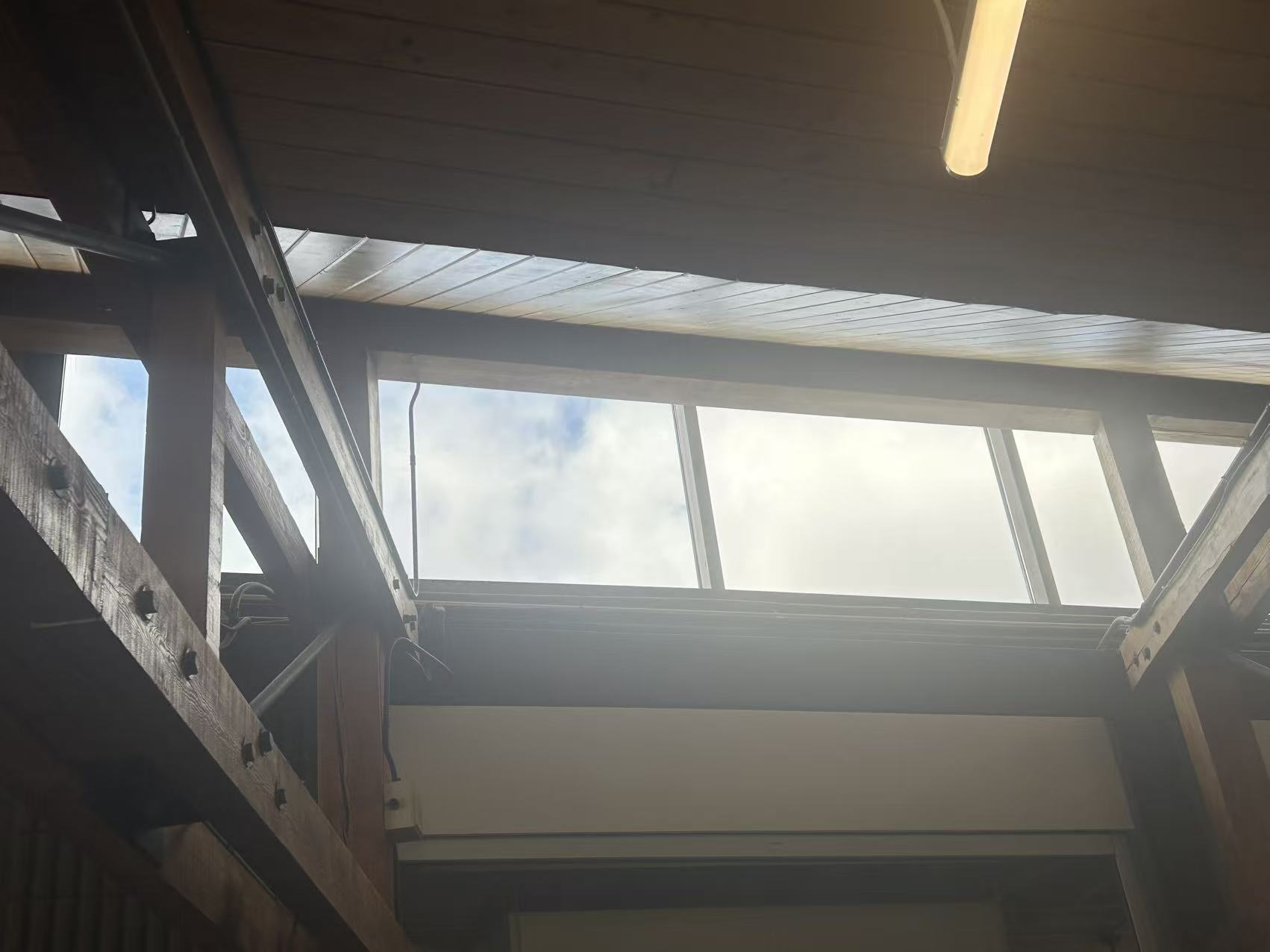
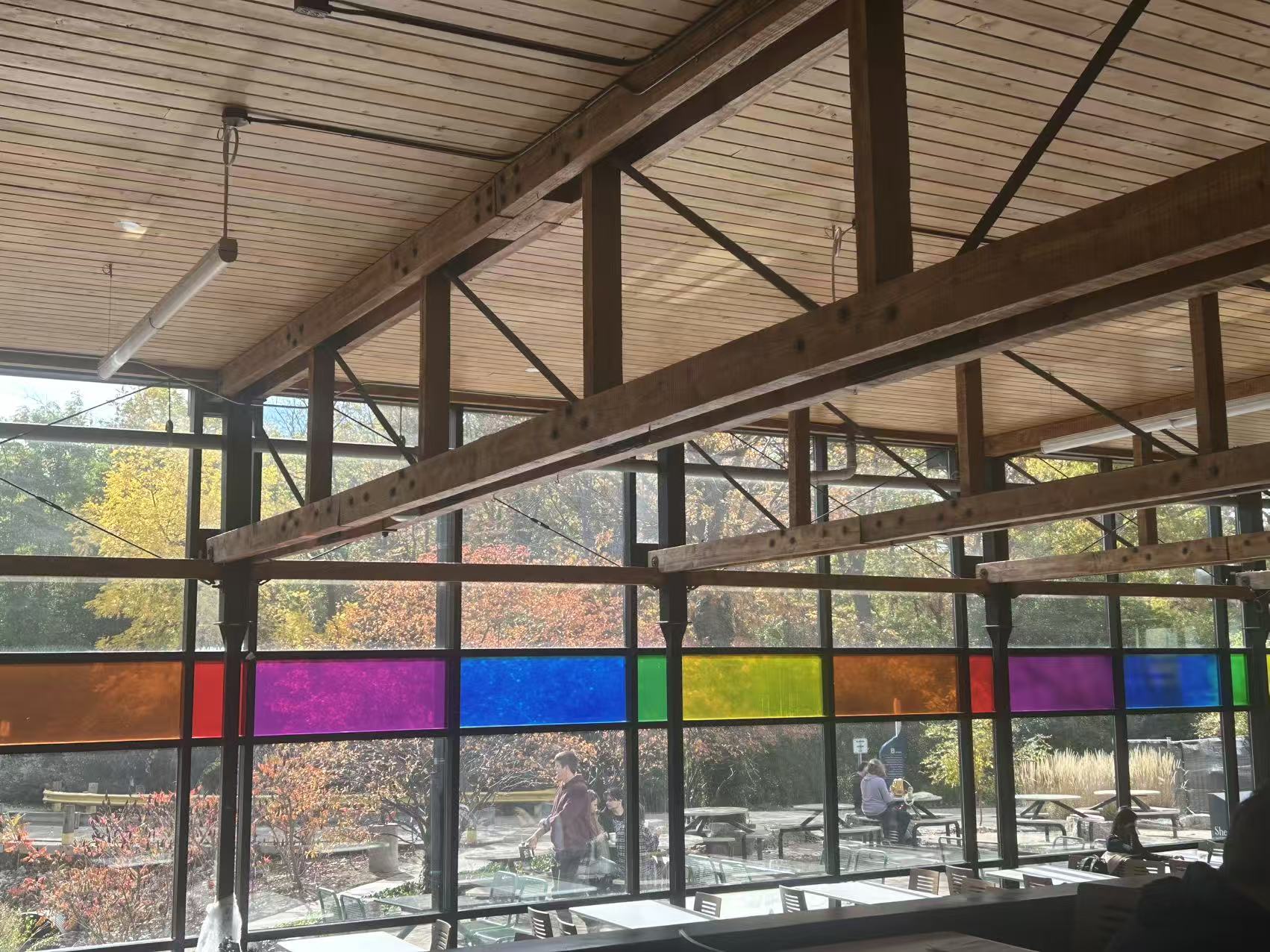
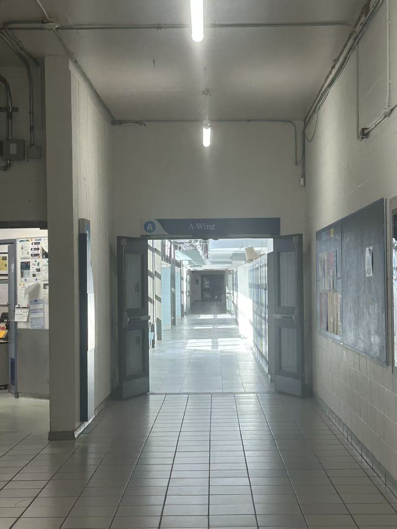
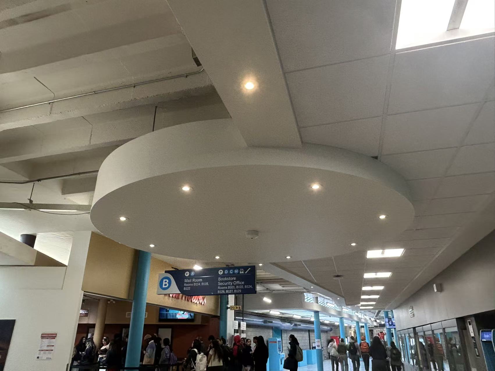
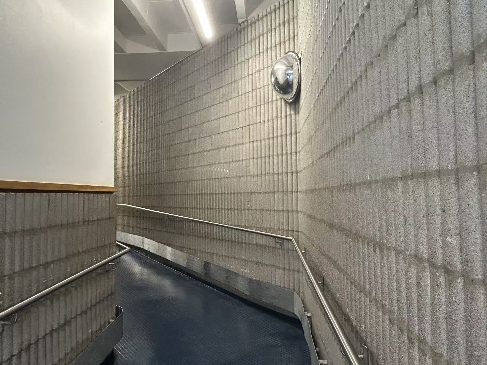
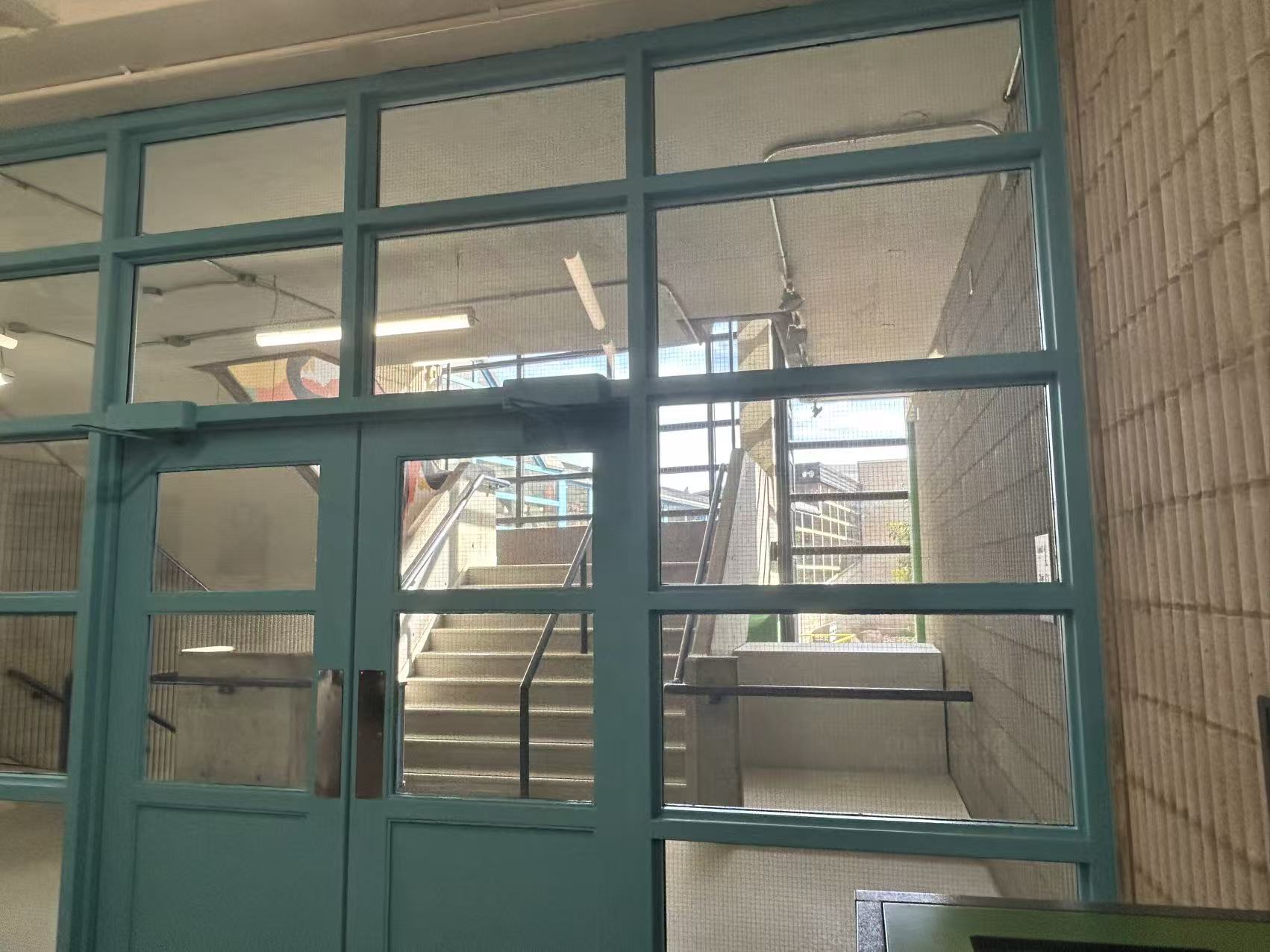
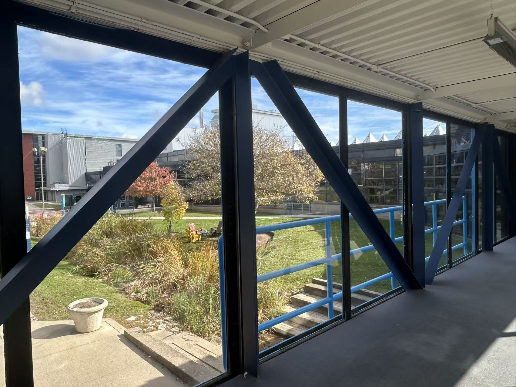
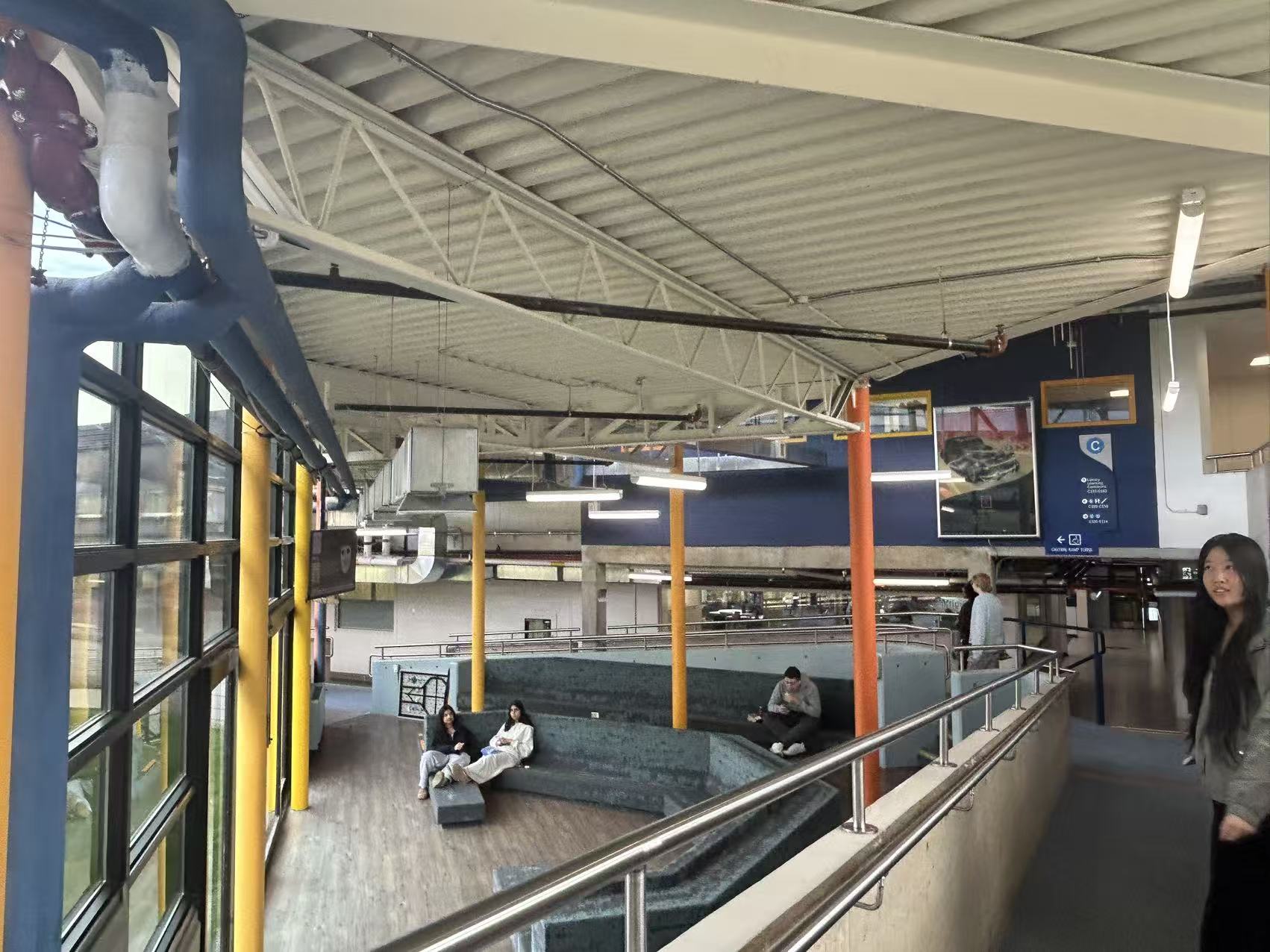
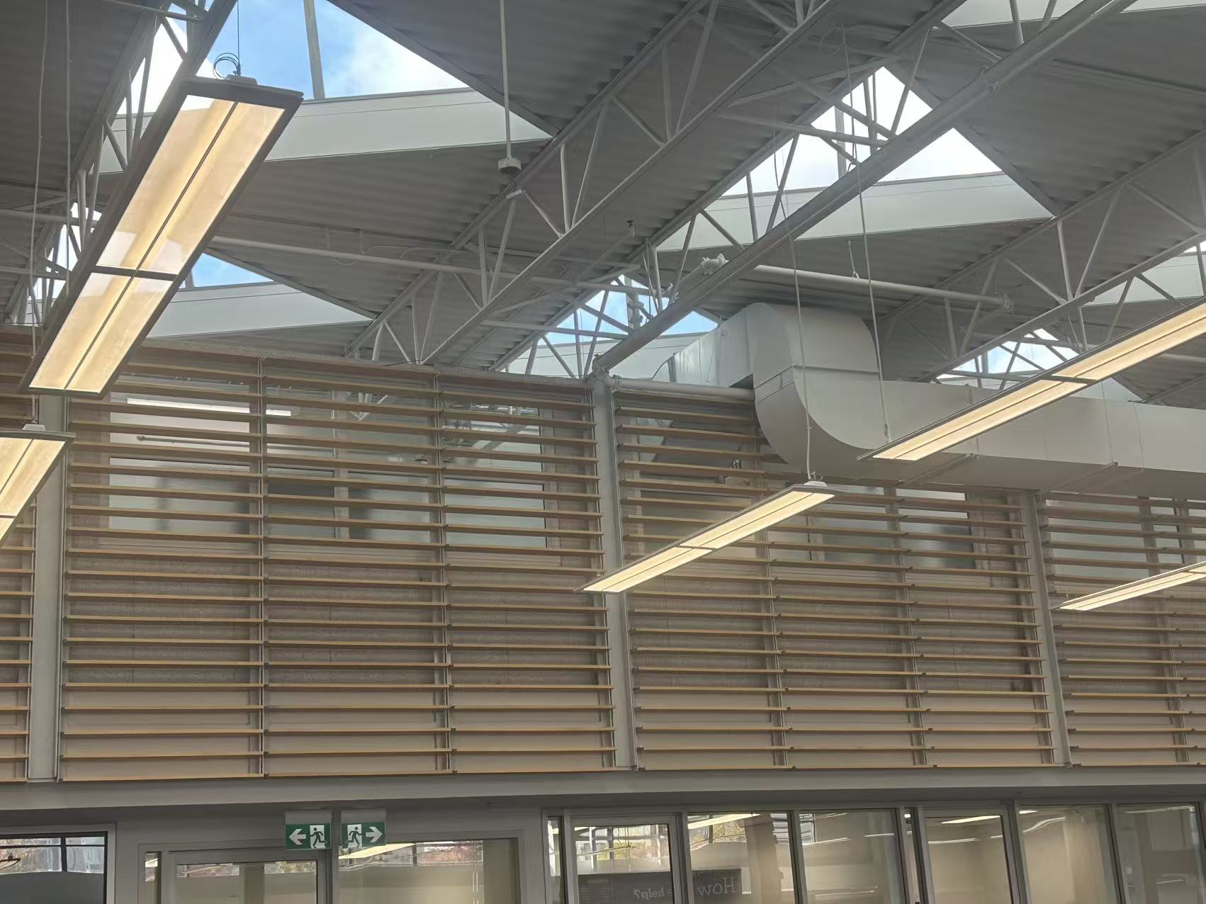
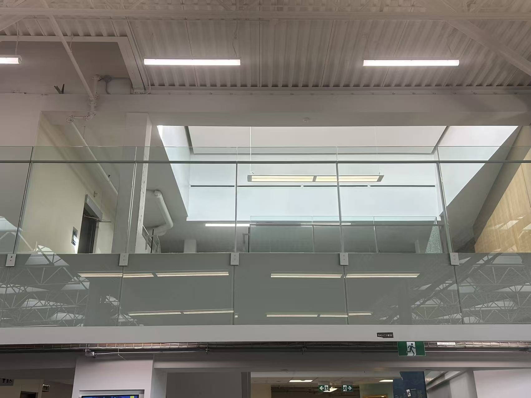
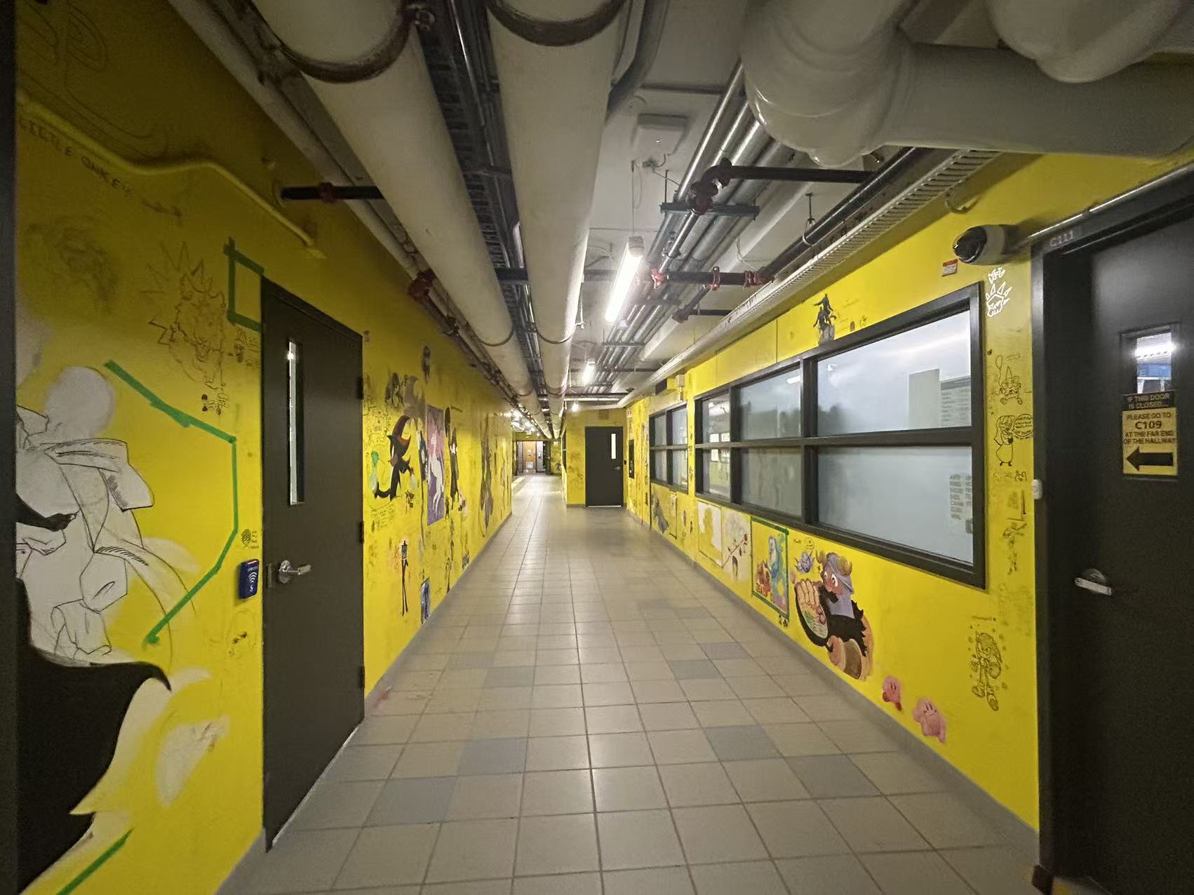
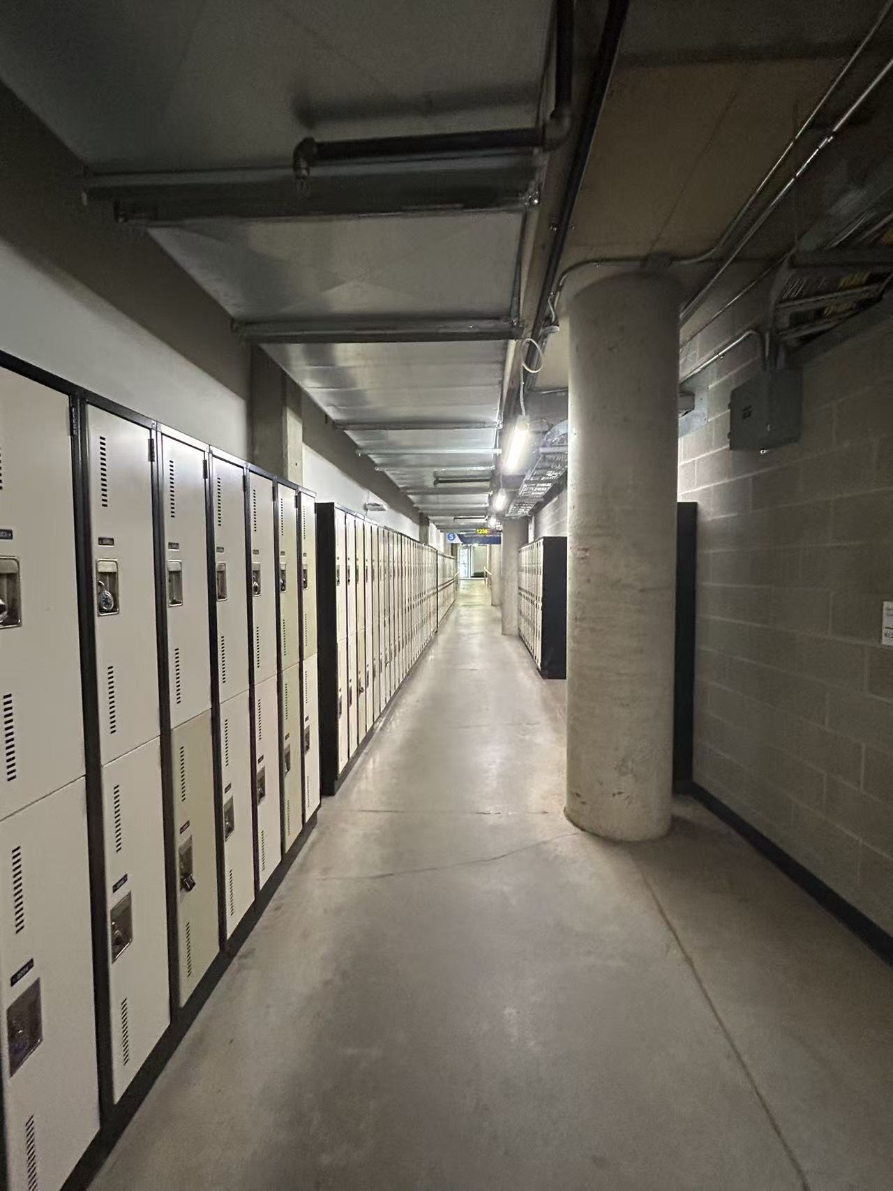
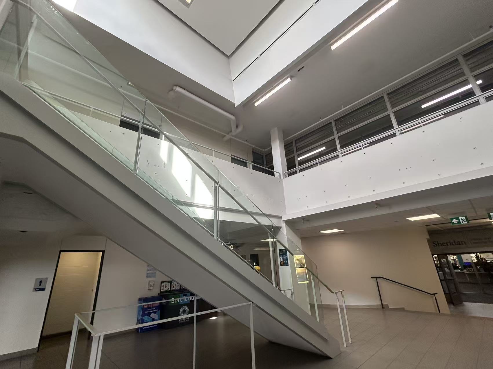
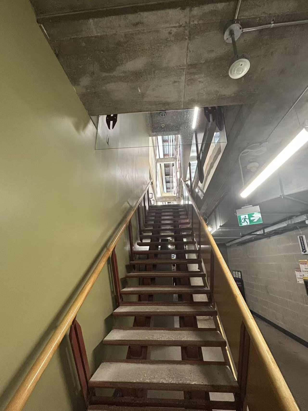
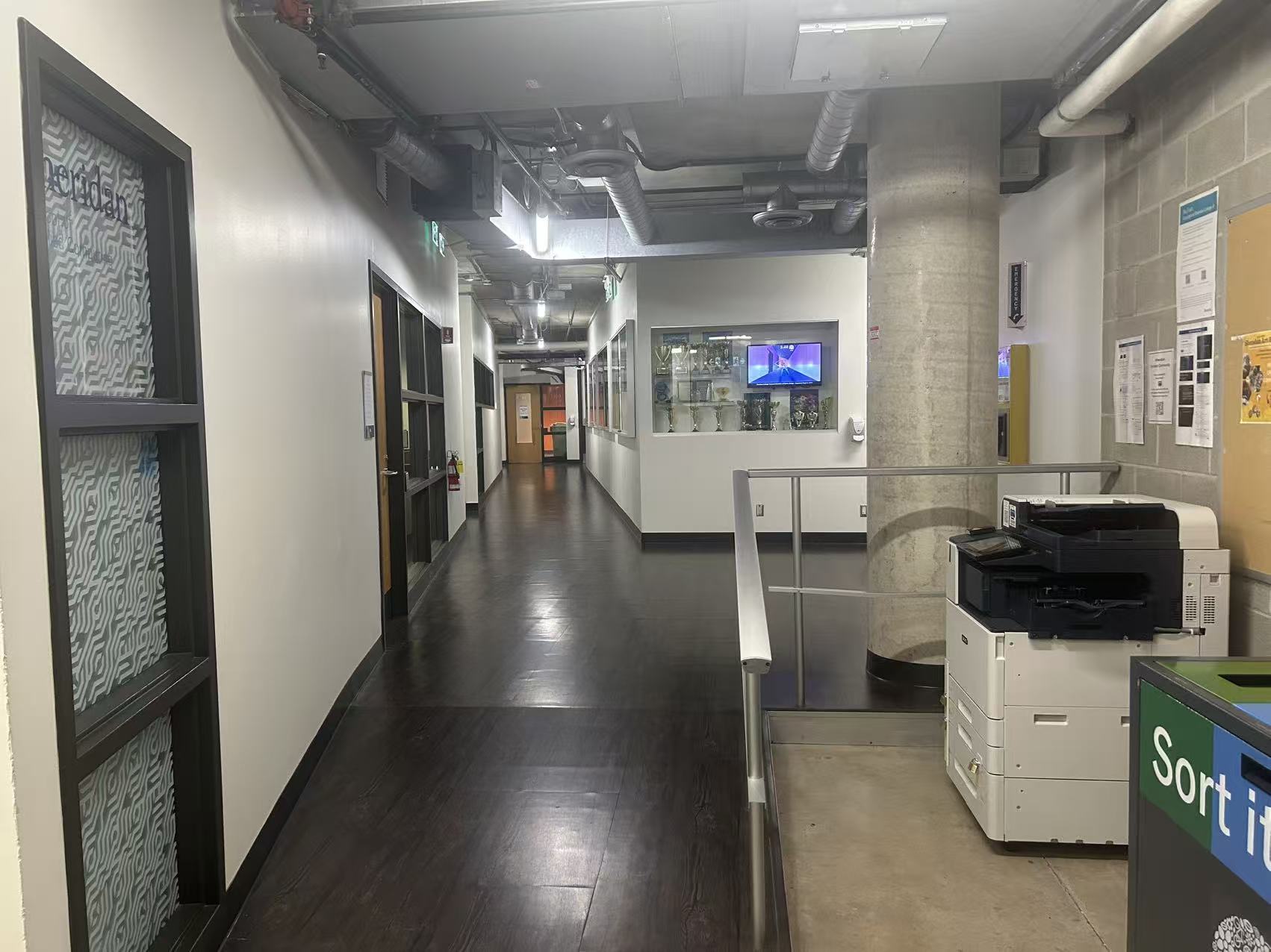
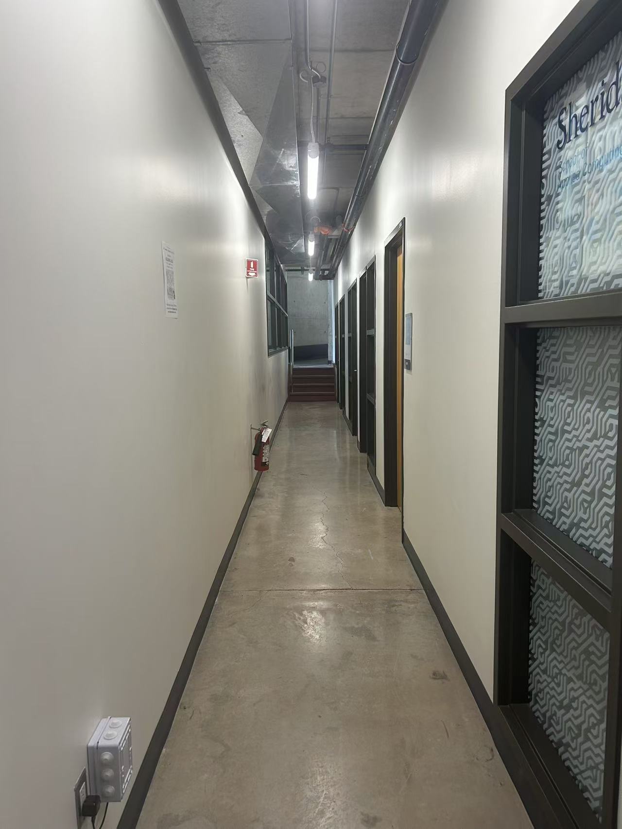
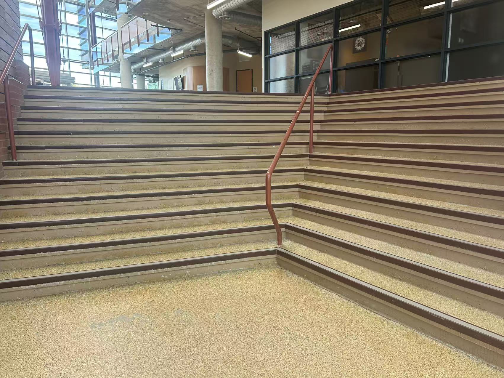
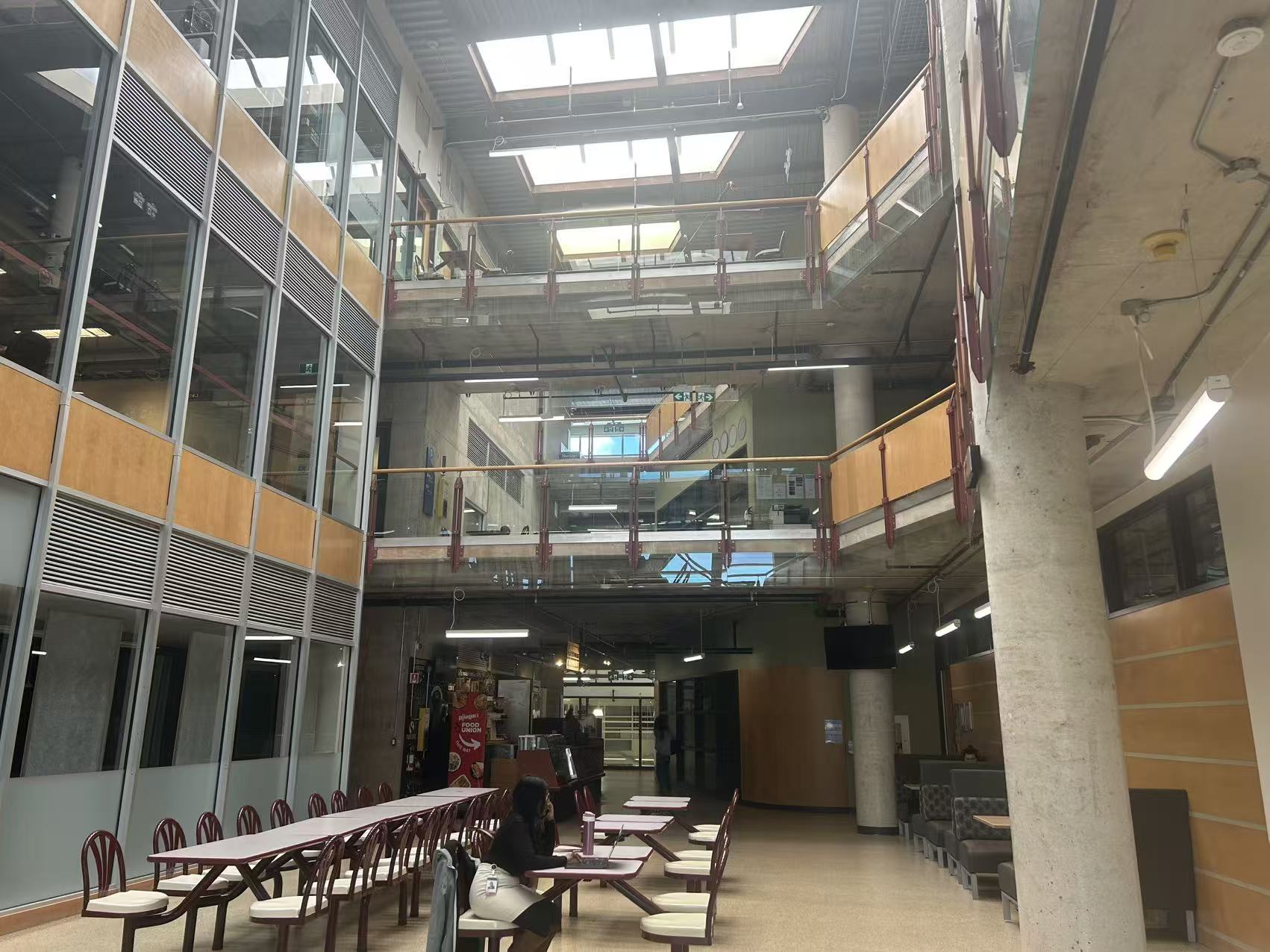
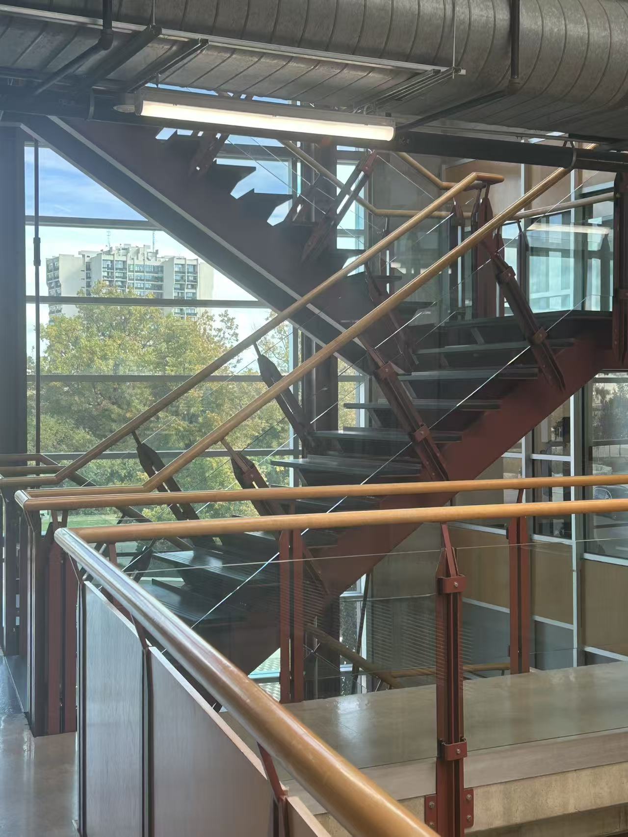
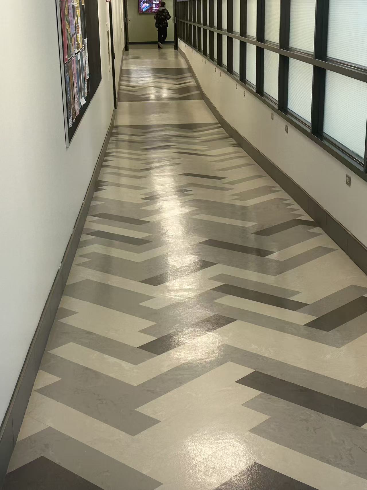
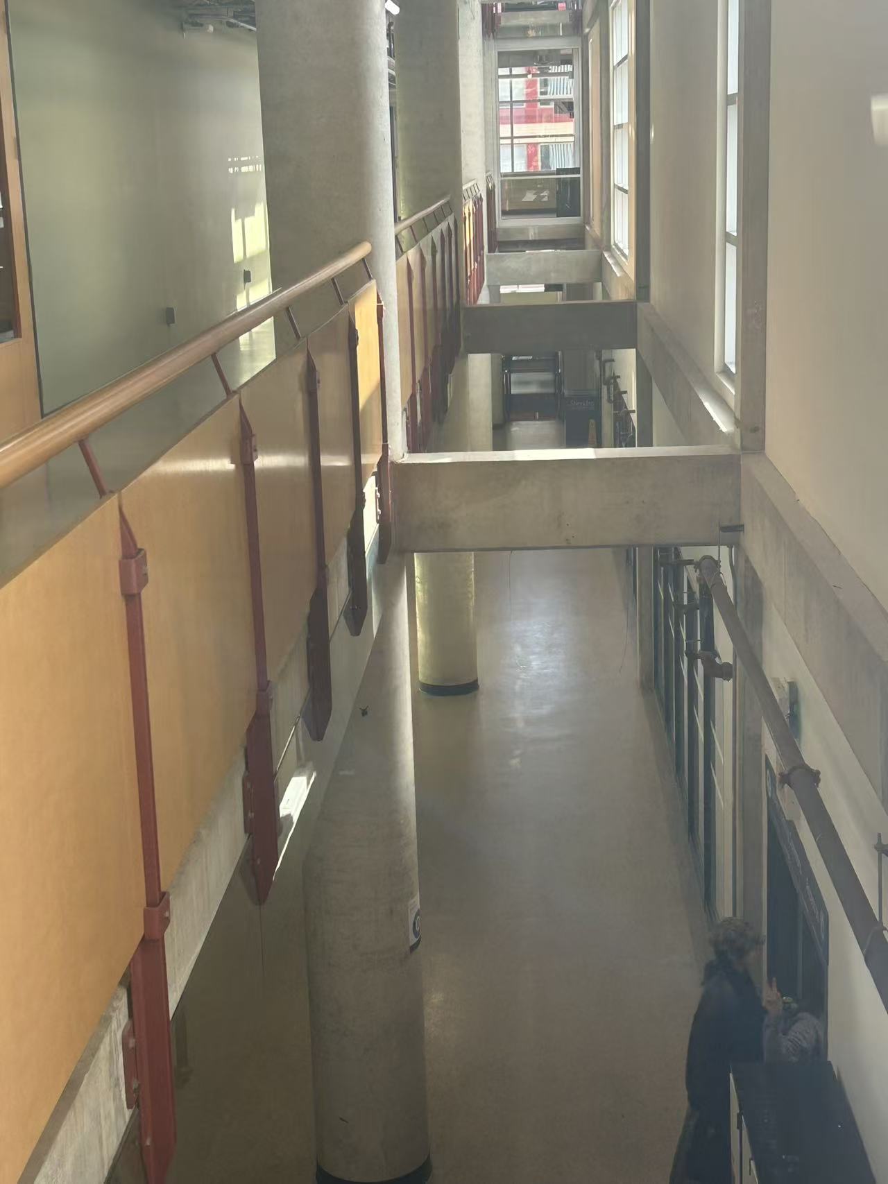
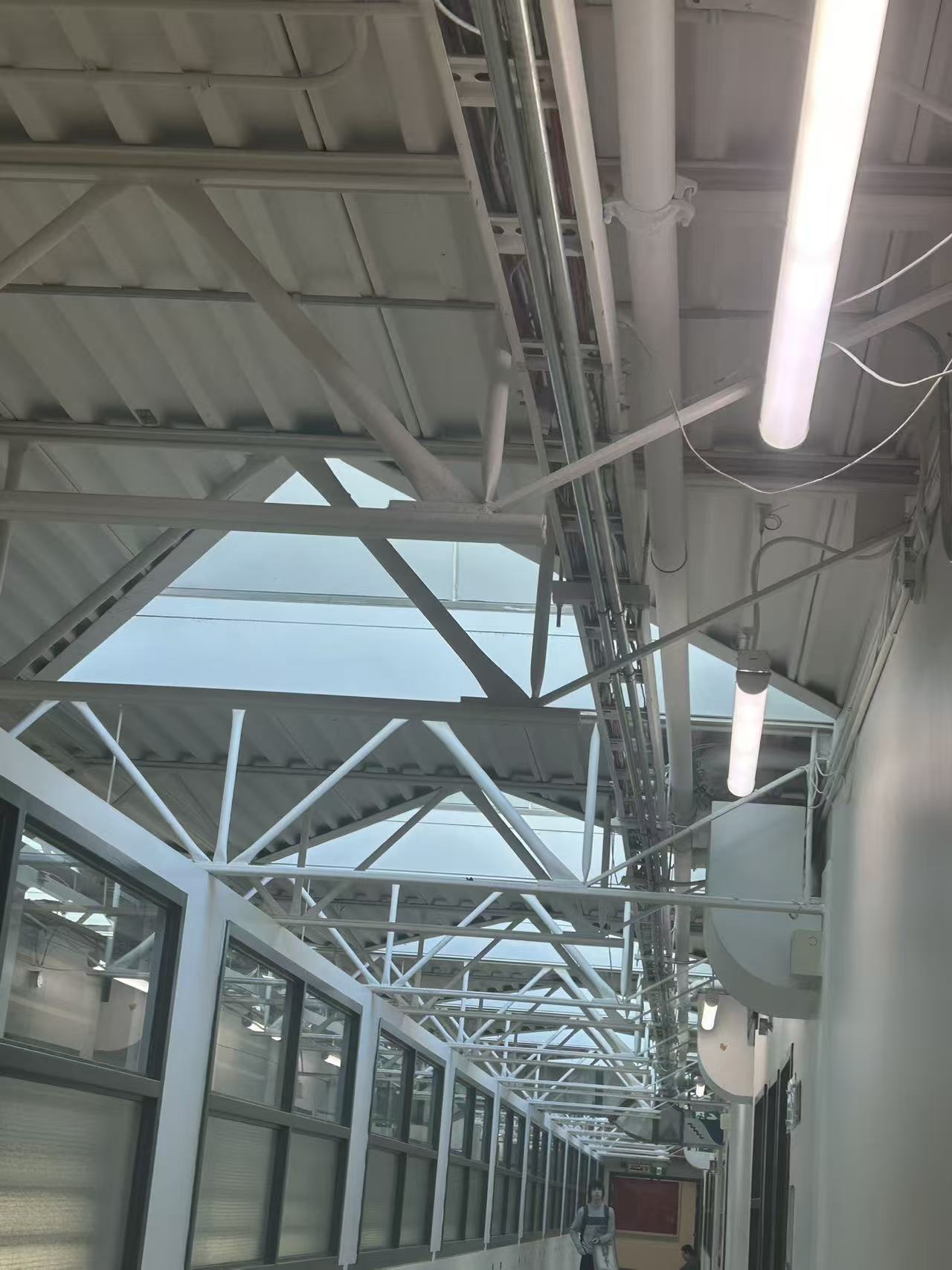
The composition of this picture uses perspective, symmetry, leading lines, and lighting to create visual interest. The rows of pillars guide the viewer's eyes toward the entrance, creating a sense of depth and direction. The repeated patterns make the space feel balanced and organized. Sunlight creates strong shadows across the walkway, adding contrast and texture. The blue sky and natural light create a calm and refreshing atmosphere. However, the empty walkway may also make some people feel lonely. Overall, the composition creates a mood that is peaceful, orderly, and slightly isolated. The composition of this picture uses leading lines, contrast, and geometric shapes to create visual interest. The staircases and railings guide the viewer's eyes upward and downward, creating a sense of depth and movement. The dark stairs contrast with the light-coloured walls, while the artificial lighting creates a warm but slightly dim atmosphere. The enclosed space and lack of people may make some viewers feel quiet, lonely, or uncomfortable. However, the clear structure and simple design can also create a feeling of order and safety. The composition of this picture uses lines, shapes, and colours to create visual interest. The wooden beams form repeated horizontal and diagonal lines, creating a sense of structure and depth. The warm brown wood gives the space a natural and comfortable feeling, while the colourful glass panels add brightness and energy. Natural light coming through the windows makes the space feel open and welcoming. Together, these elements may make people feel relaxed, cheerful, and curious. Overall, the composition creates a warm, creative, and lively atmosphere. The composition of this picture uses leading lines, contrast, and natural lighting to create a sense of depth and openness. The wooden beams and window frames guide the viewer's eyes toward the bright skylight, making it the main focus. The contrast between the dark wooden structure and the bright sky creates a dramatic visual effect. The natural sunlight makes the space feel peaceful and relaxing, while the dark areas may create a slightly mysterious atmosphere. Overall, the composition creates a mood that is calm, quiet, and welcoming, encouraging people to look upward and feel connected to the outside environment. The composition of this picture uses repetition, leading lines, natural lighting, and colourful glass panels to create visual interest. The wooden beams create a sense of structure and balance, while the large windows connect the indoor space with nature. The colourful glass and sunlight create a cheerful, warm, and welcoming atmosphere, making people feel relaxed and comfortable. However, the strong sunlight may cause glare and make people uncomfortable. The large number of beams and window frames may also make the space feel visually crowded and distracting. Overall, the design feels lively and open but could be improved with better lighting control. The composition of this picture uses symmetry, leading lines, and lighting to create a sense of depth and direction. The floor tiles, walls, and ceiling lights guide people's eyes toward the end of the hallway. The natural light in the distance creates a feeling of openness, while the darker foreground makes the space feel quiet and slightly lonely. However, the plain walls and lack of colour may make people feel bored or uncomfortable. The strong contrast between bright and dark areas may also cause visual discomfort. Overall, the space feels organized but somewhat cold and unwelcoming. The composition of this picture uses curved shapes, repetition, and lighting to create a modern and organized space. The large circular ceiling design becomes the main focus, while the repeated lights and columns guide people's eyes through the hallway. The bright lighting and open space create a lively and welcoming atmosphere. The presence of people makes the environment feel active and social. However, the low ceiling and large circular structure may make the space feel crowded or overwhelming. The mixture of different ceiling designs and lighting may also create visual confusion. Overall, the space feels energetic but slightly busy. The composition of this picture uses curved lines, repetition, and texture to create a sense of movement and depth. The curved walls and handrails guide people's eyes along the ramp, creating curiosity about what is around the corner. The repeated concrete patterns create an organized feeling, while the grey colours make the space feel cold and quiet. The narrow pathway may also make people feel uncomfortable or trapped. However, the lack of natural light and colourful elements makes the environment feel dull and unwelcoming. Overall, the space feels functional but could be improved with warmer lighting and colours. The composition of this picture uses geometric shapes, repetition, and contrast to create a sense of structure and depth. The blue-green window frames form a grid pattern, while the glass allows people to see the stairs and natural light beyond. The bright lighting and cool colours create a calm and refreshing atmosphere. However, the large number of frames may make the space feel visually crowded. The glass doors may also create confusion about where to enter, especially for people with visual impairments. Overall, the design feels organized and open but could benefit from clearer entrances and better accessibility. The composition of this picture uses geometric shapes, leading lines, and natural lighting to create a sense of depth and openness. The large windows provide a clear view of the outdoor environment, while the diagonal steel beams create strong visual patterns. The blue sky, green grass, and sunlight make people feel relaxed, peaceful, and connected to nature. However, the thick steel beams may block parts of the view and make the space feel visually crowded. The strong sunlight may also cause glare and discomfort. Overall, the space feels bright and welcoming but could benefit from better sunlight control. The composition of this picture uses leading lines, colourful columns, and an open layout to create a sense of depth and movement. The bright colours and natural light make the space feel energetic, welcoming, and social. The seating areas encourage people to relax and interact with others. However, the exposed pipes, ceiling structures, and different colours may make the space feel visually crowded and distracting. The large open area may also create noise and reduce privacy for people studying or resting. Overall, the space feels lively and creative but could benefit from a quieter and more organized design. The composition of this picture uses repetition, geometric shapes, and natural lighting to create a sense of structure and openness. The repeated wooden panels and metal beams create rhythm and balance, while the skylights bring natural light into the space. The combination of warm wood and bright lighting makes people feel calm, comfortable, and connected to the outdoors. However, the exposed pipes and complex ceiling structures may make the space feel visually crowded. The artificial lights and sunlight may also cause glare and discomfort. Overall, the space feels modern and organized but could benefit from a simpler design. The composition of this picture uses symmetry, geometric shapes, and lighting to create a modern and open atmosphere. The glass railings and large ceiling opening create a sense of depth and connection between different floors. The white walls and bright lighting make people feel calm, focused, and comfortable. However, the lack of colour may make the space feel cold and boring. The glass surfaces may also create reflections and glare, causing visual discomfort. Overall, the space feels clean and organized but could benefit from warmer colours and more natural elements to make it more welcoming. The composition of this picture uses bright colours, leading lines, and repetition to create a lively and energetic atmosphere. The yellow walls and colourful artwork attract people's attention, while the floor tiles and ceiling pipes guide their eyes toward the end of the hallway. The playful drawings may make people feel cheerful, creative, and curious. However, the strong yellow colour and large number of drawings may feel overwhelming and distracting. The exposed pipes and artificial lighting may also make the space feel crowded and uncomfortable. Overall, the hallway feels fun and creative but could benefit from better visual balance. The composition of this picture uses leading lines, repetition, and perspective to create a strong sense of depth. The repeated lockers and ceiling pipes guide people's eyes toward the end of the hallway, creating an organized atmosphere. However, the grey colours, dim lighting, and exposed pipes make the space feel cold, lonely, and uncomfortable. The large concrete pillar also interrupts the visual flow and makes the hallway feel narrower. The lack of natural light and decoration may make people feel bored or stressed. Overall, the space feels functional but could benefit from brighter lighting and warmer colours. The composition of this picture uses diagonal lines, geometric shapes, and natural lighting to create a sense of movement and openness. The staircase becomes the main focus, guiding people's eyes upward, while the glass railings make the space feel modern and spacious. The white walls and bright lighting create a clean, calm, and organized atmosphere. However, the lack of colour and decoration may make the space feel cold and boring. The glass railings may also cause reflections and glare, creating visual discomfort. Overall, the space feels open and functional but could benefit from warmer colours and more welcoming details. The composition of this picture uses leading lines, perspective, and contrast to create a sense of height and movement. The stairs and wooden handrails guide people's eyes upward, while the narrow space creates a feeling of tension and curiosity. The green wall adds some warmth, but the dark concrete ceiling makes the environment feel enclosed and uncomfortable. However, the open stair design may make some people feel unsafe, especially those afraid of heights. The uneven lighting and narrow staircase may also cause discomfort. Overall, the space feels functional but could benefit from brighter lighting and a more open design. The composition of this picture uses leading lines, contrast, and perspective to create a sense of depth and direction. The dark floor and white walls guide people's eyes toward the end of the hallway, while the glass displays add visual interest. The clean design and organized layout may make people feel calm and focused. However, the exposed ceiling pipes and large concrete pillar make the space feel industrial and slightly cold. The narrow hallway and lack of natural light may also create an uncomfortable atmosphere. Overall, the space feels functional and organized but could benefit from warmer lighting and decoration. The composition of this picture uses leading lines, perspective, and contrast to create a strong sense of depth. The narrow walls, ceiling pipes, and lights guide people's eyes toward the end of the hallway. The simple colours and clean walls create an organized but cold atmosphere. The enclosed space and lack of natural light may make people feel lonely, uncomfortable, or trapped. However, the narrow pathway and stairs at the end may also create accessibility challenges. Overall, the hallway feels quiet and functional but could benefit from warmer lighting, more colours, and a more welcoming design. The composition of this picture uses repetition, symmetry, and leading lines to create a sense of balance and movement. The wide stairs and repeated horizontal lines guide people's eyes upward, while the natural light makes the space feel bright and open. The warm colours create a calm and welcoming atmosphere. However, the large number of steps may make people feel tired or overwhelmed. The lack of a clearly visible alternative route may also create accessibility concerns for people with mobility difficulties. Overall, the space feels organized and spacious but could benefit from more accessible pathways and clearer directions. The composition of this picture uses vertical lines, repetition, and natural lighting to create a sense of height and openness. The glass walls, bridges, and skylights make the space feel modern and connected, while the wooden panels add warmth. The seating areas create a welcoming atmosphere where people can relax, study, and socialize. However, the tall ceiling and large open space may cause noise and reduce privacy. The complex structures and different materials may also make the environment feel visually busy. Overall, the space feels bright and social but could benefit from quieter areas and better visual organization. The composition of this picture uses diagonal lines, geometric shapes, and natural lighting to create a sense of movement and depth. The stairs and handrails guide people's eyes upward, while the large windows connect the indoor space with nature. The sunlight and wooden handrails create a warm and welcoming atmosphere, making people feel relaxed and comfortable. However, the overlapping stairs, railings, and exposed pipes may make the space feel visually crowded and confusing. The glass panels may also cause reflections and glare. Overall, the space feels modern and open but could benefit from a simpler design. The composition of this picture uses geometric patterns, repetition, and leading lines to create a sense of movement and depth. The zigzag floor design attracts people's attention and guides their eyes toward the end of the hallway. The neutral colours create a calm and organized atmosphere, while the patterned floor adds energy and creativity. However, the busy floor pattern may cause visual confusion or dizziness, especially for people with visual impairments. The reflective surface may also create glare and discomfort. Overall, the hallway feels modern and interesting but could benefit from a simpler floor design. The composition of this picture uses leading lines, vertical shapes, and natural lighting to create a sense of depth and height. The railings and concrete pillars guide people's eyes through the different floors, while the large windows bring sunlight into the space. The warm wooden panels create a comfortable atmosphere, making people feel calm and relaxed. However, the narrow walkway and open space between floors may make some people feel uncomfortable or afraid of heights. The large concrete pillars also block parts of the view. Overall, the space feels open but slightly crowded and complex. The composition of this picture uses repetition, geometric shapes, and leading lines to create a sense of depth and movement. The white metal beams form repeated triangular patterns, guiding people's eyes toward the end of the hallway. The skylights bring natural light into the space, creating a bright, open, and calm atmosphere. However, the exposed pipes, wires, and complex ceiling structures may make the space feel visually crowded and distracting. The long, narrow hallway may also feel repetitive and boring. Overall, the space feels modern and organized but could benefit from a simpler ceiling design.

Design Challenge 2
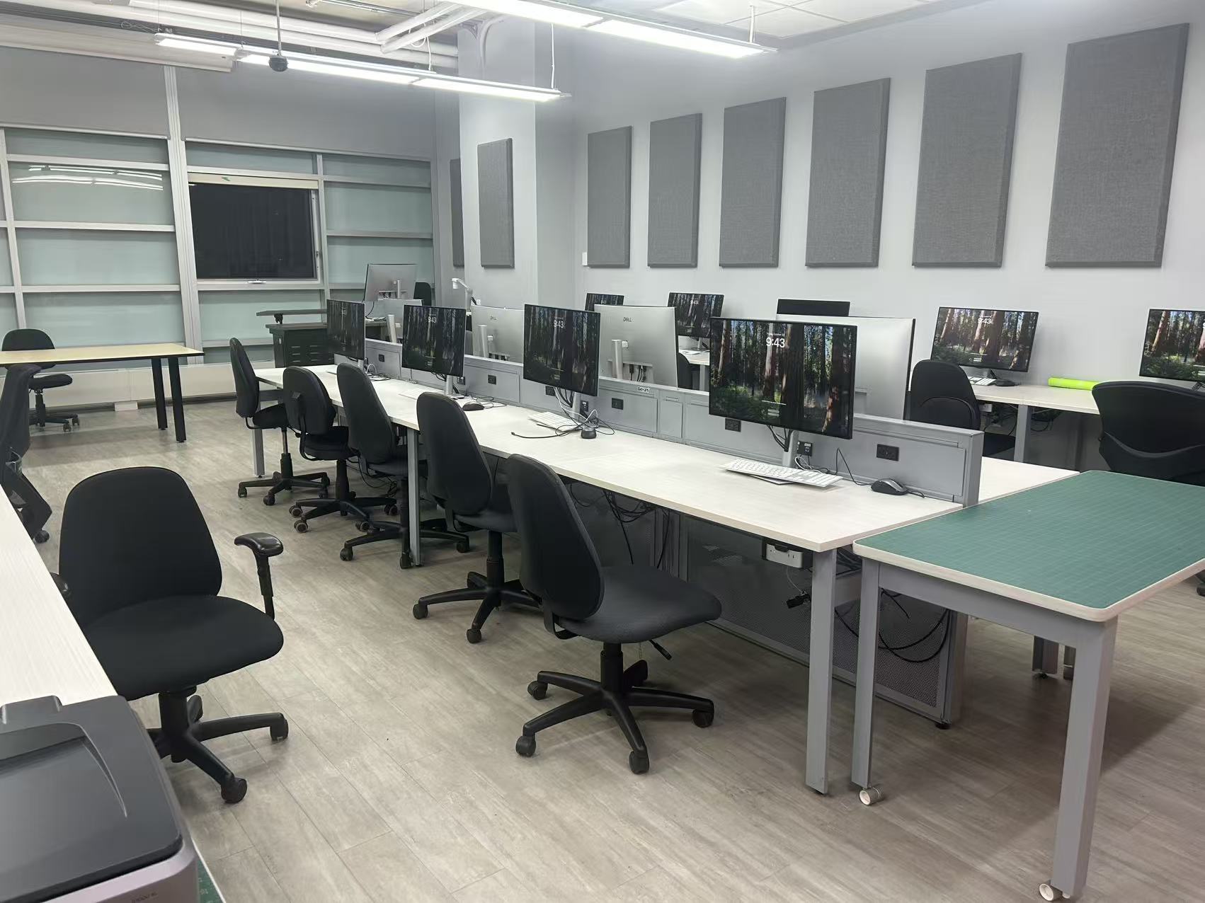
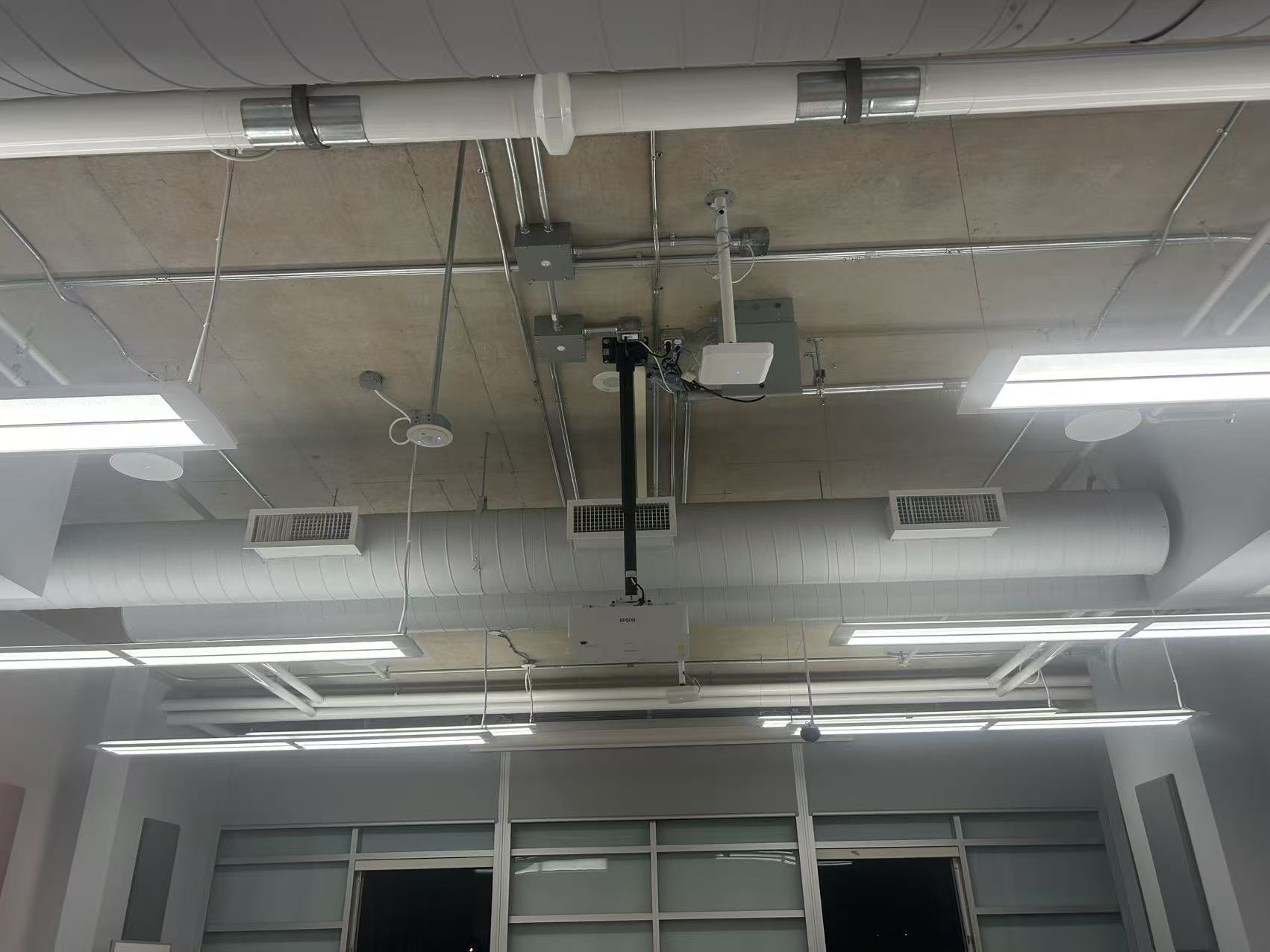
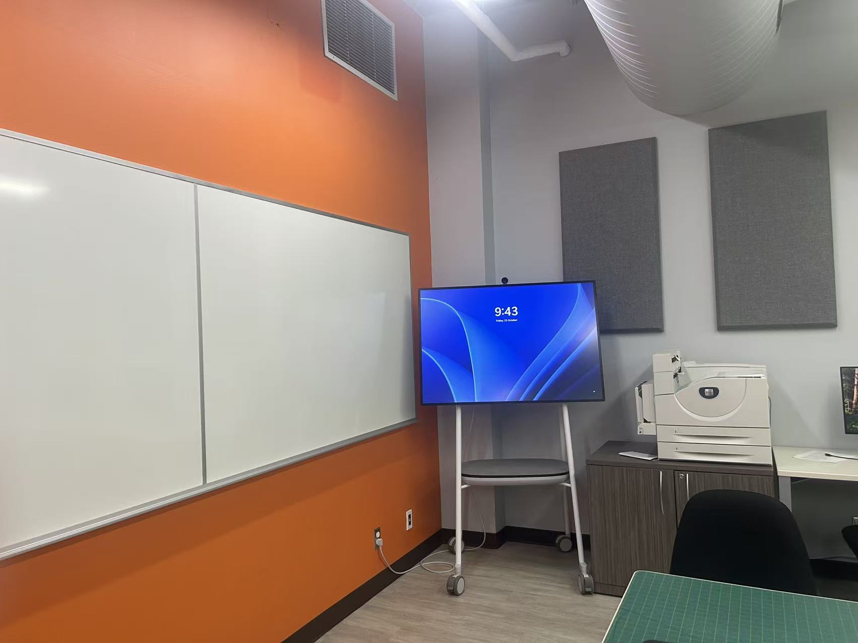
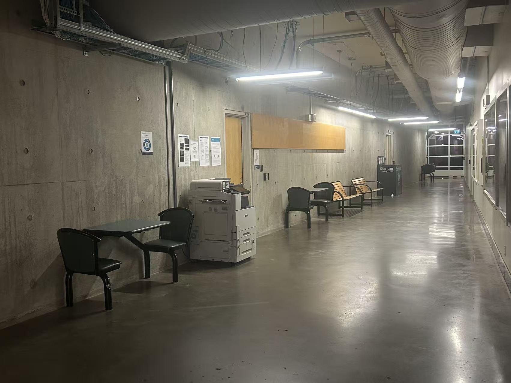
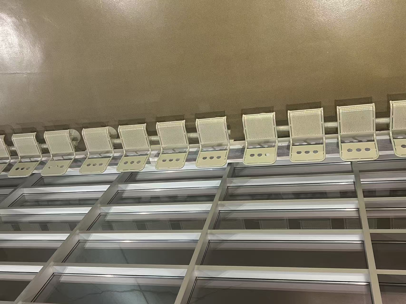
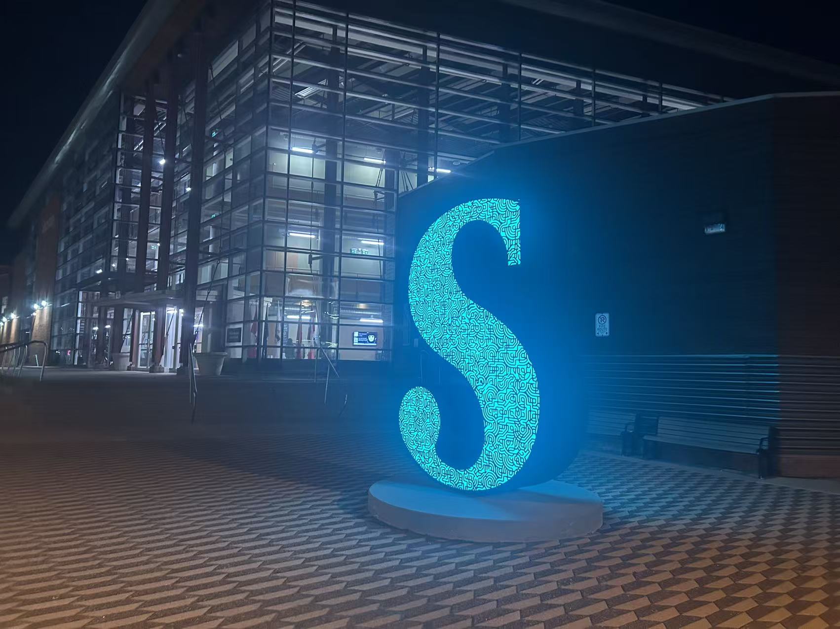
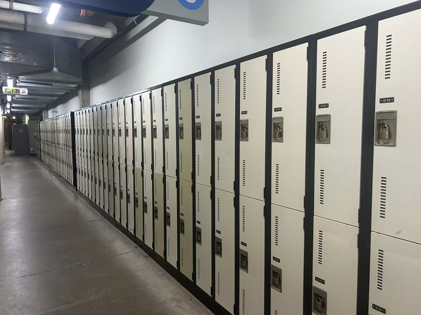
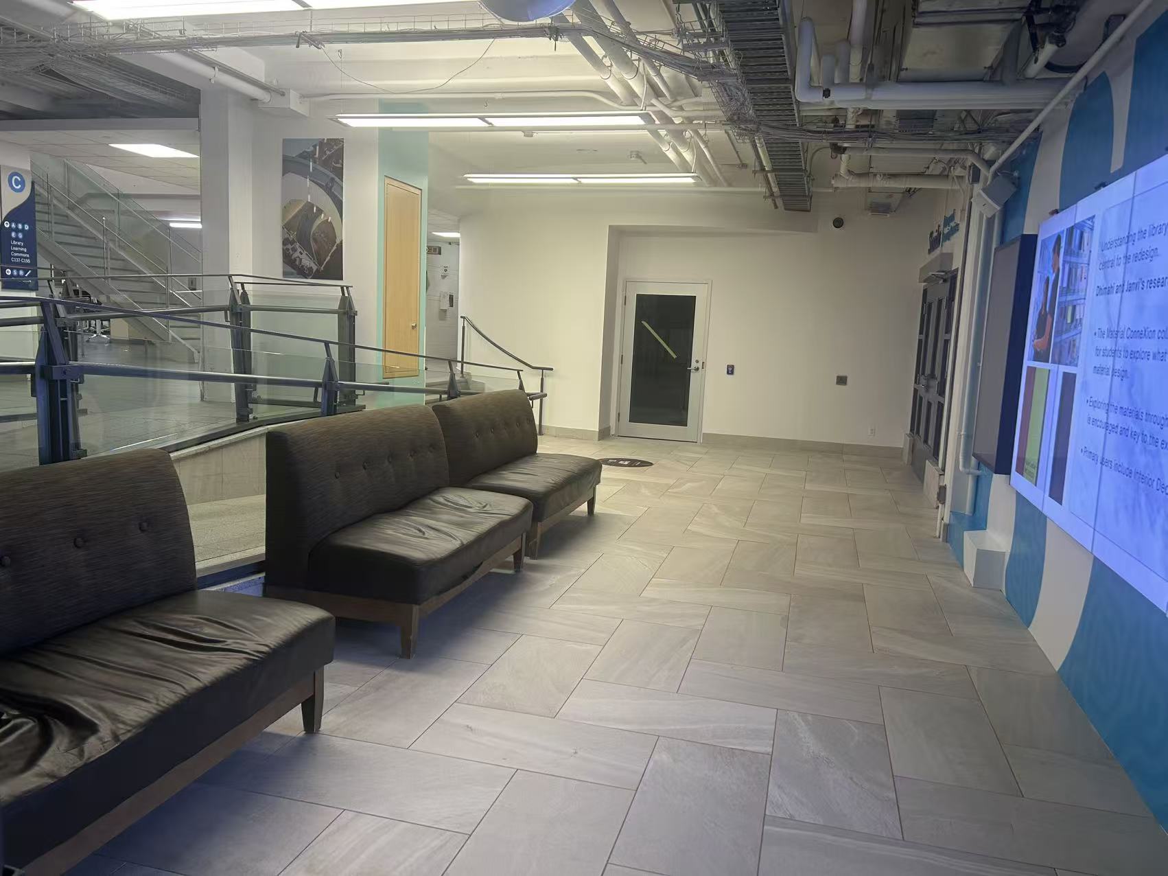
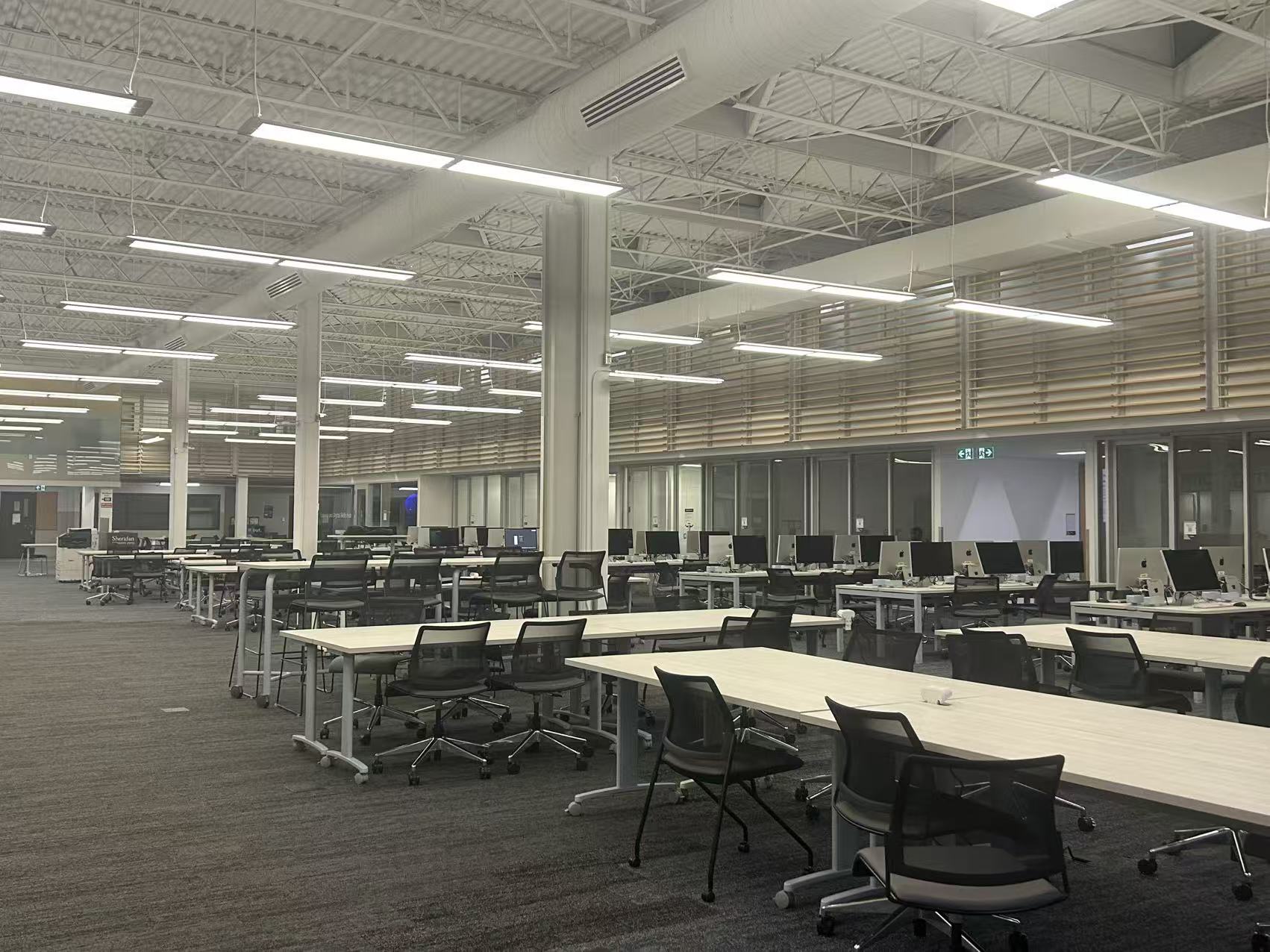
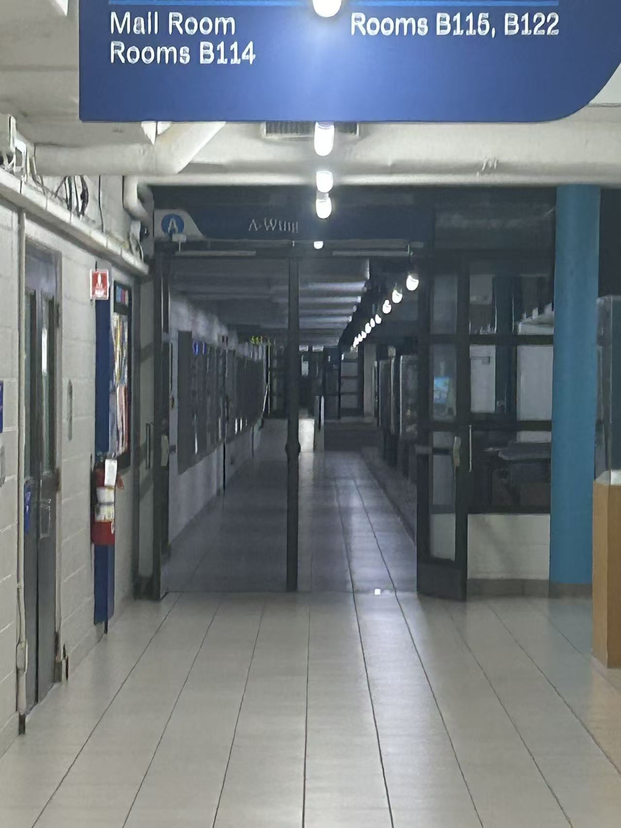
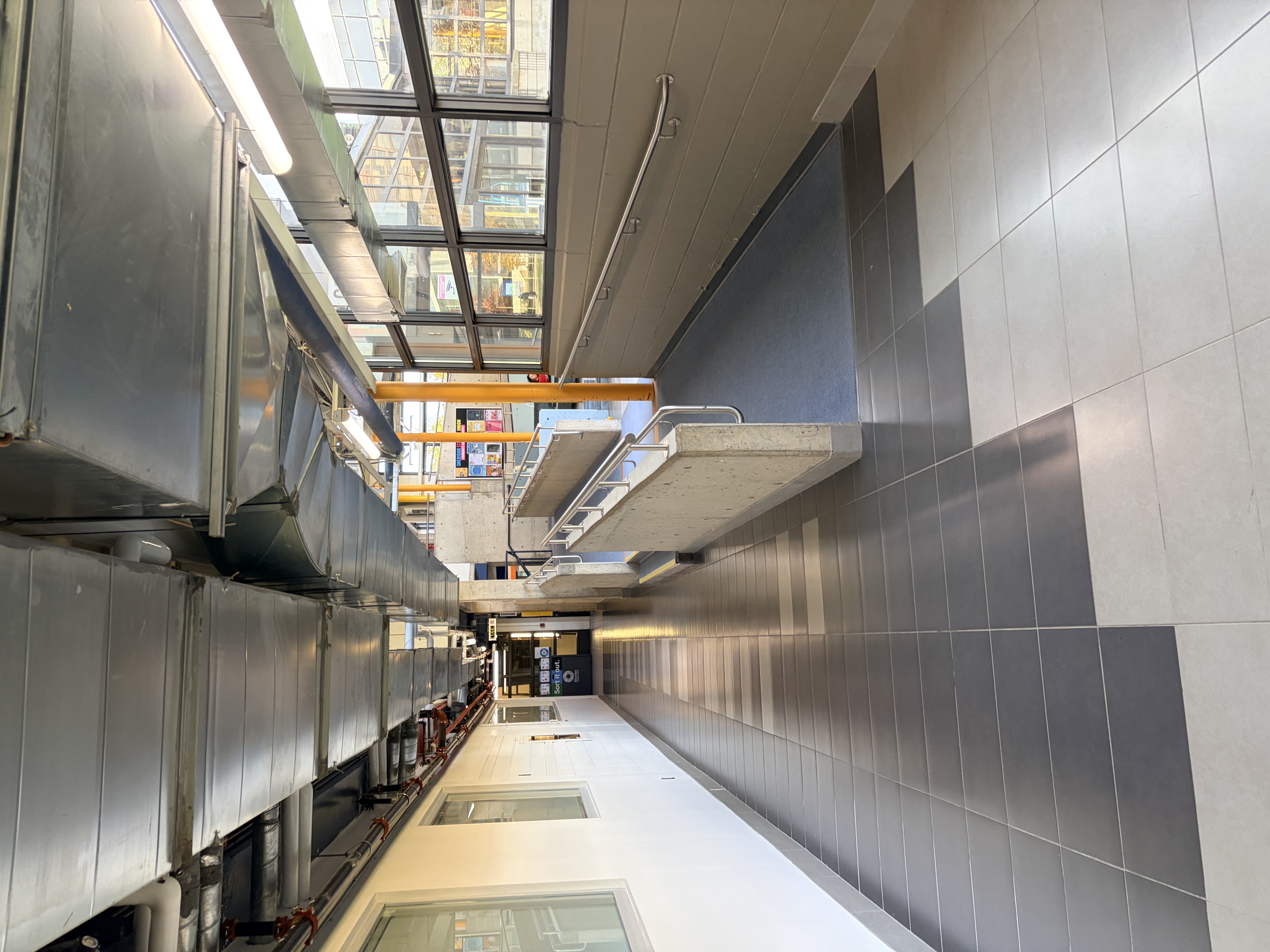
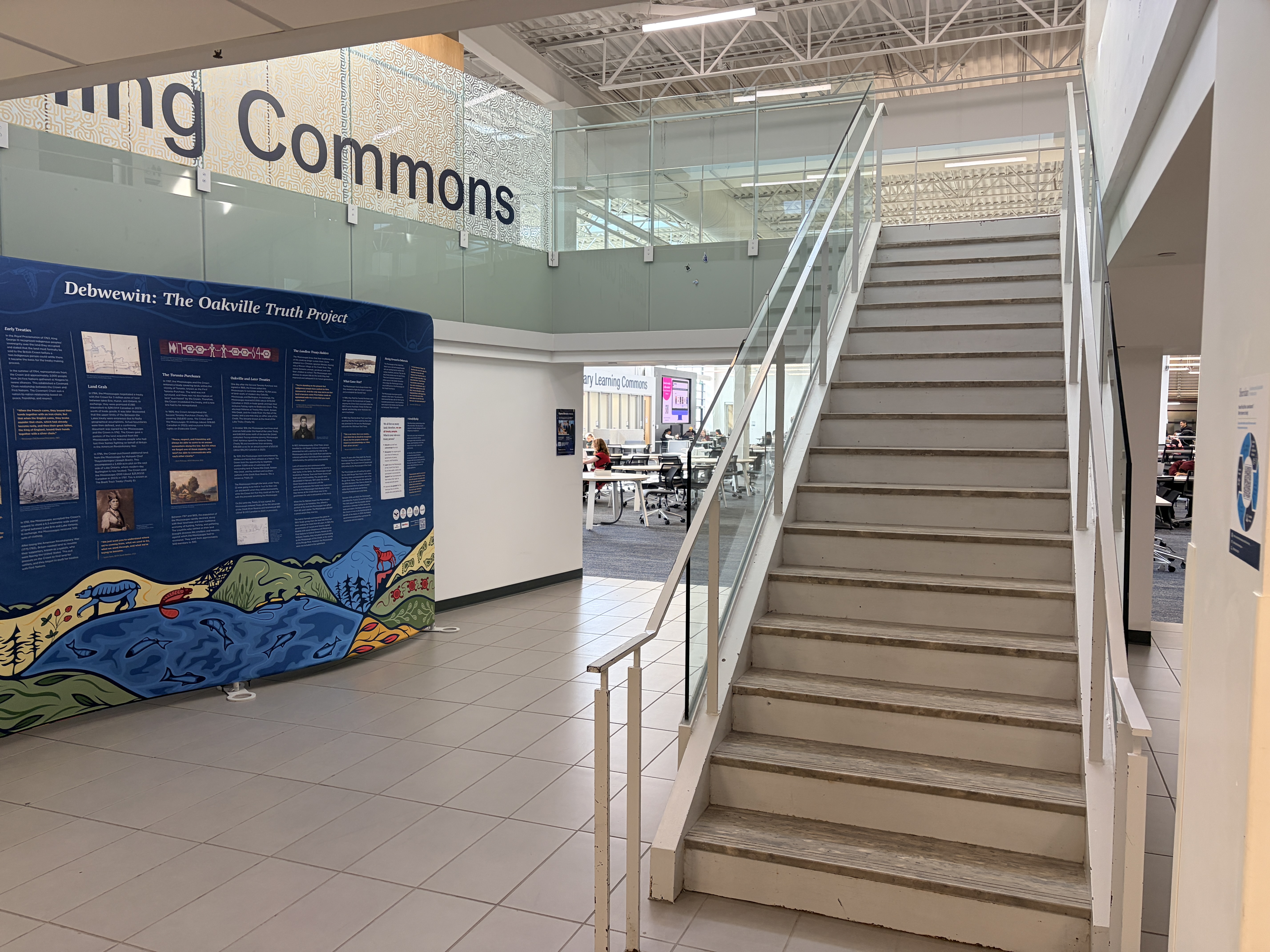
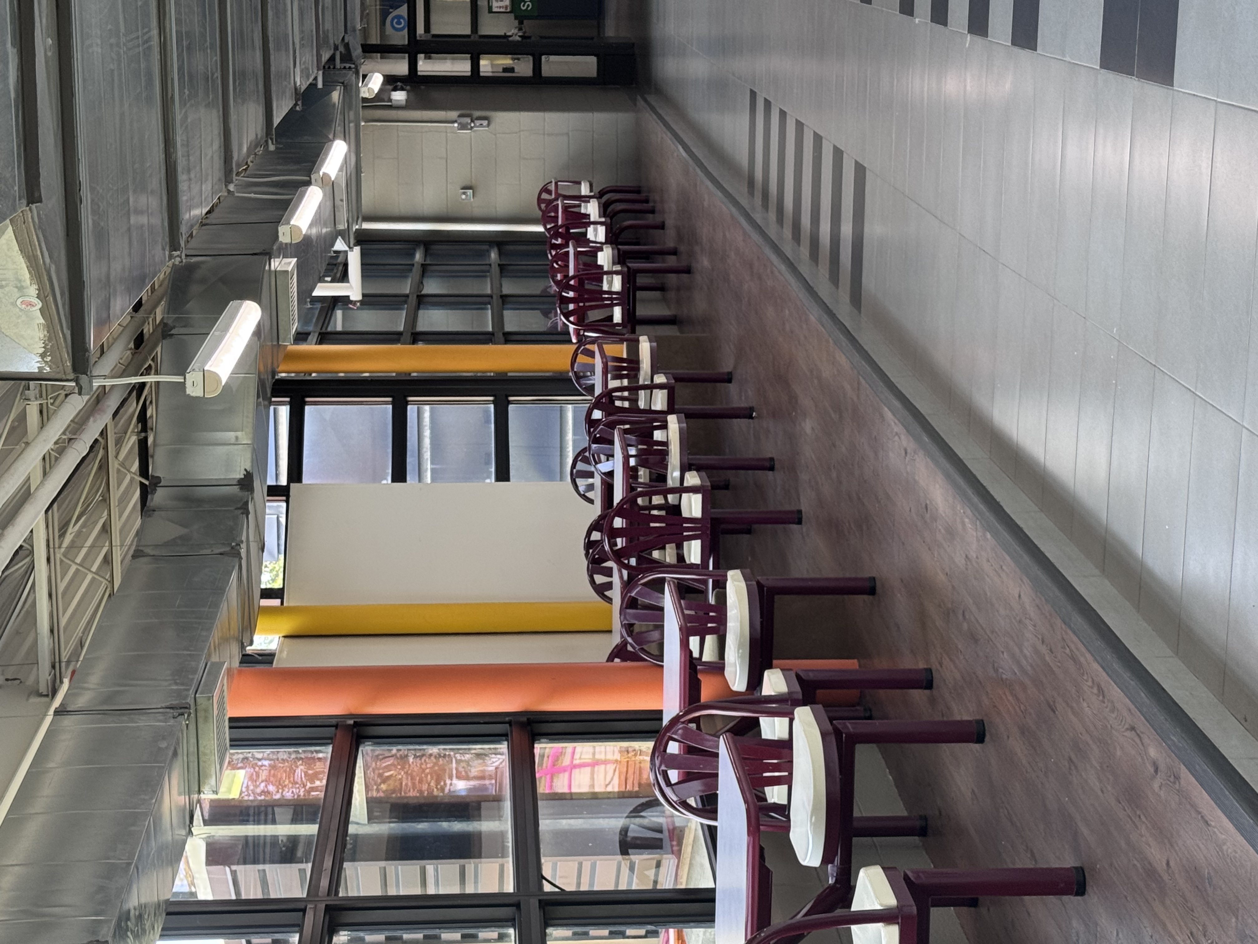
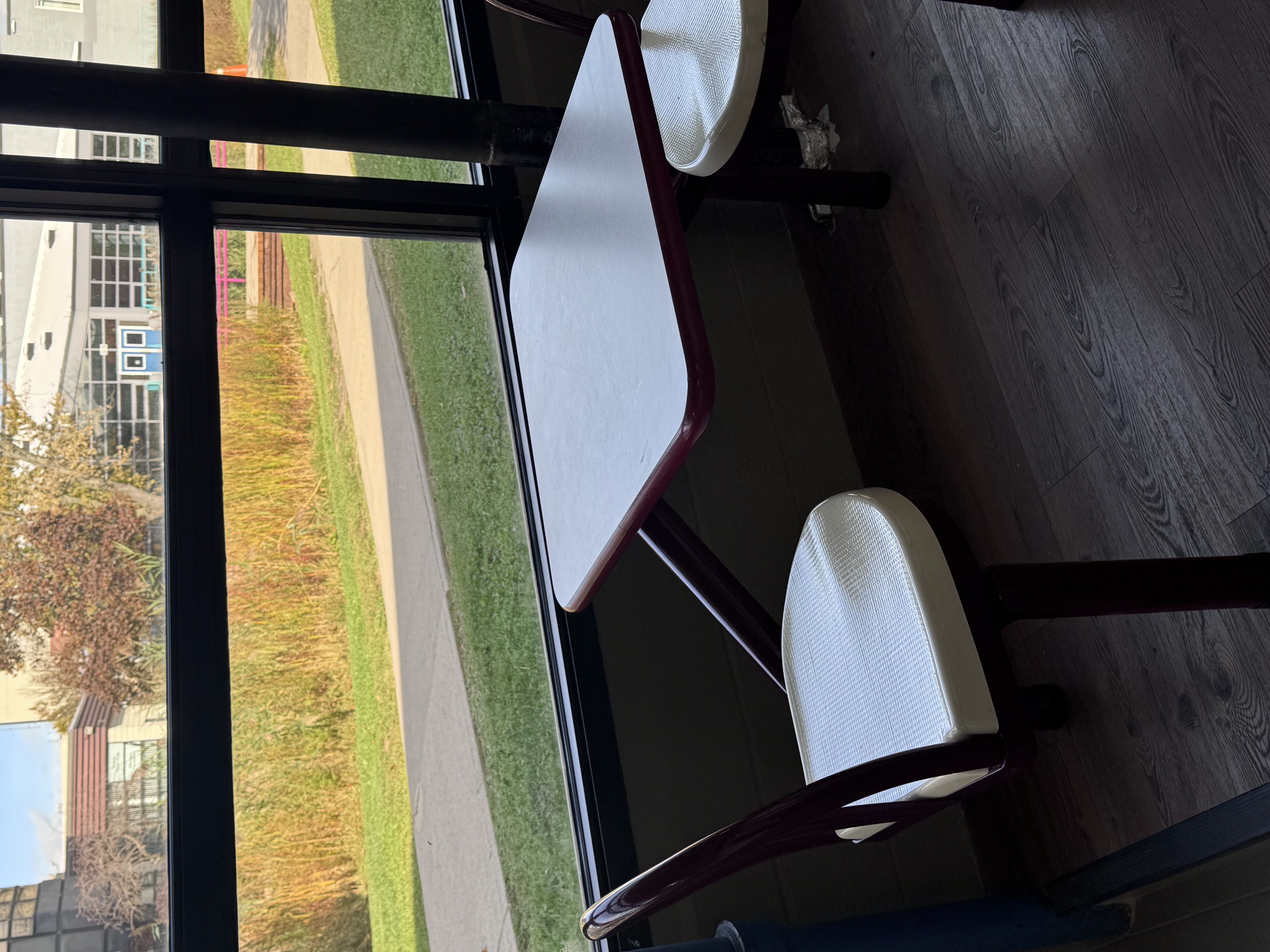
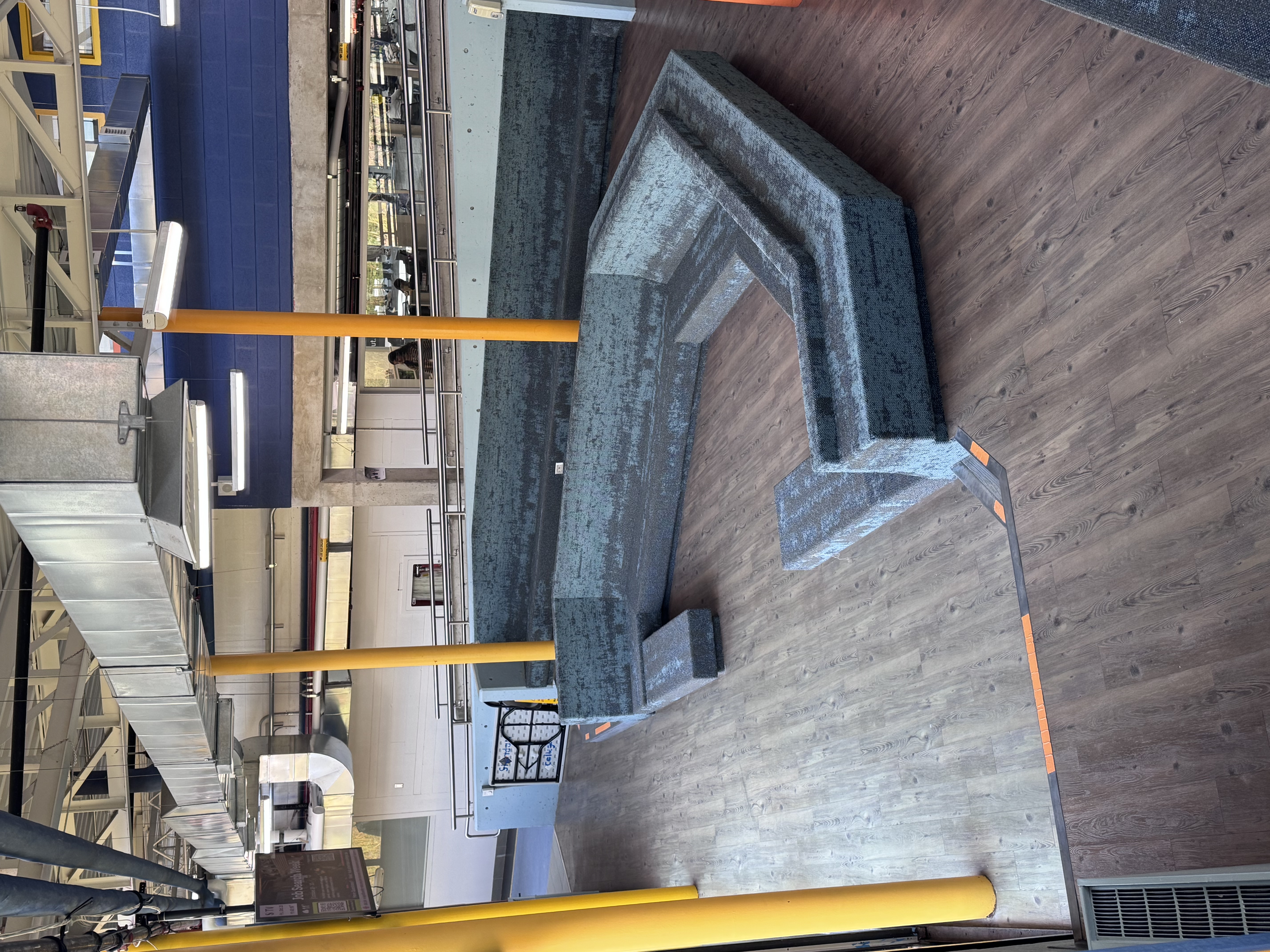
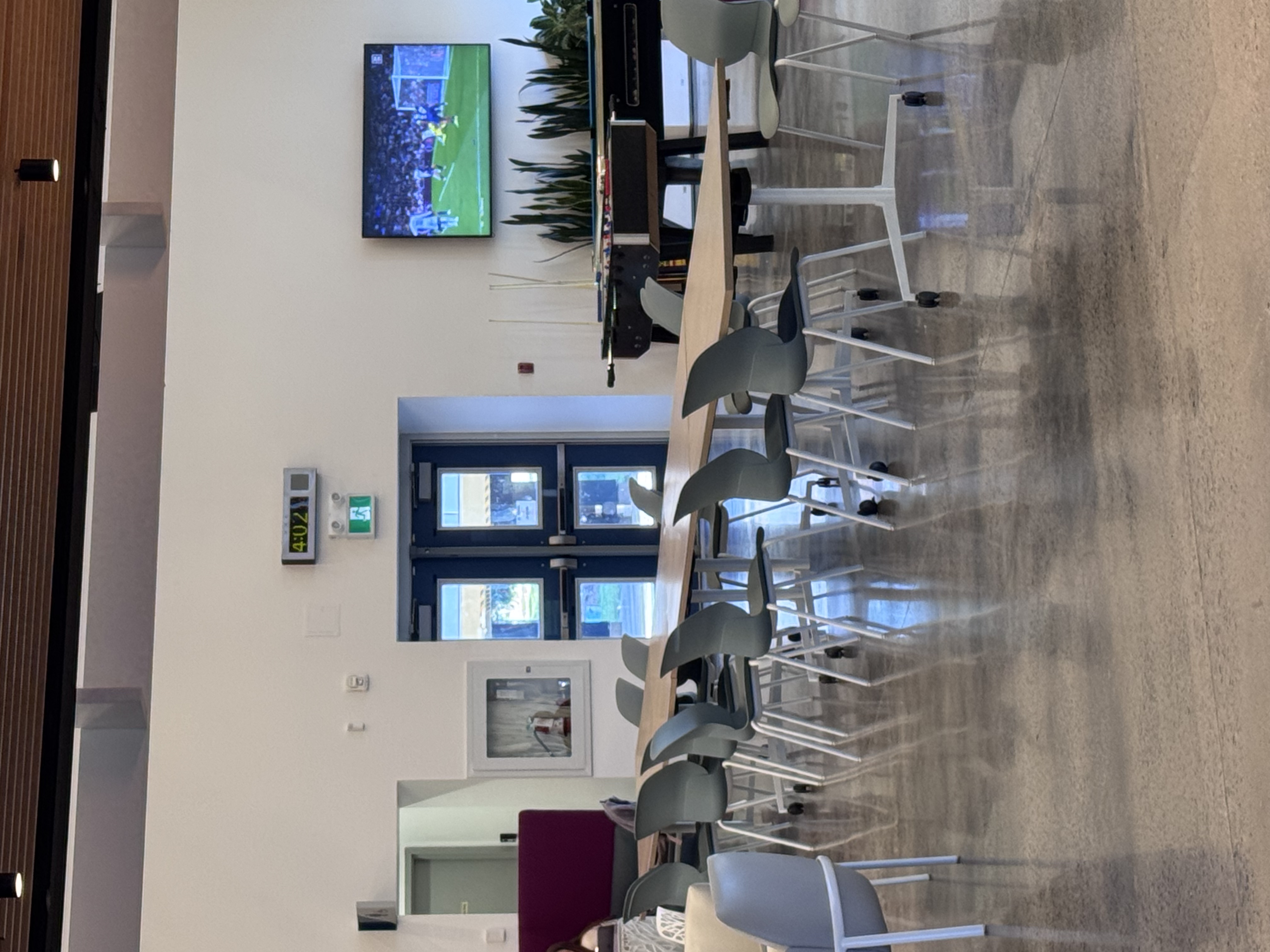
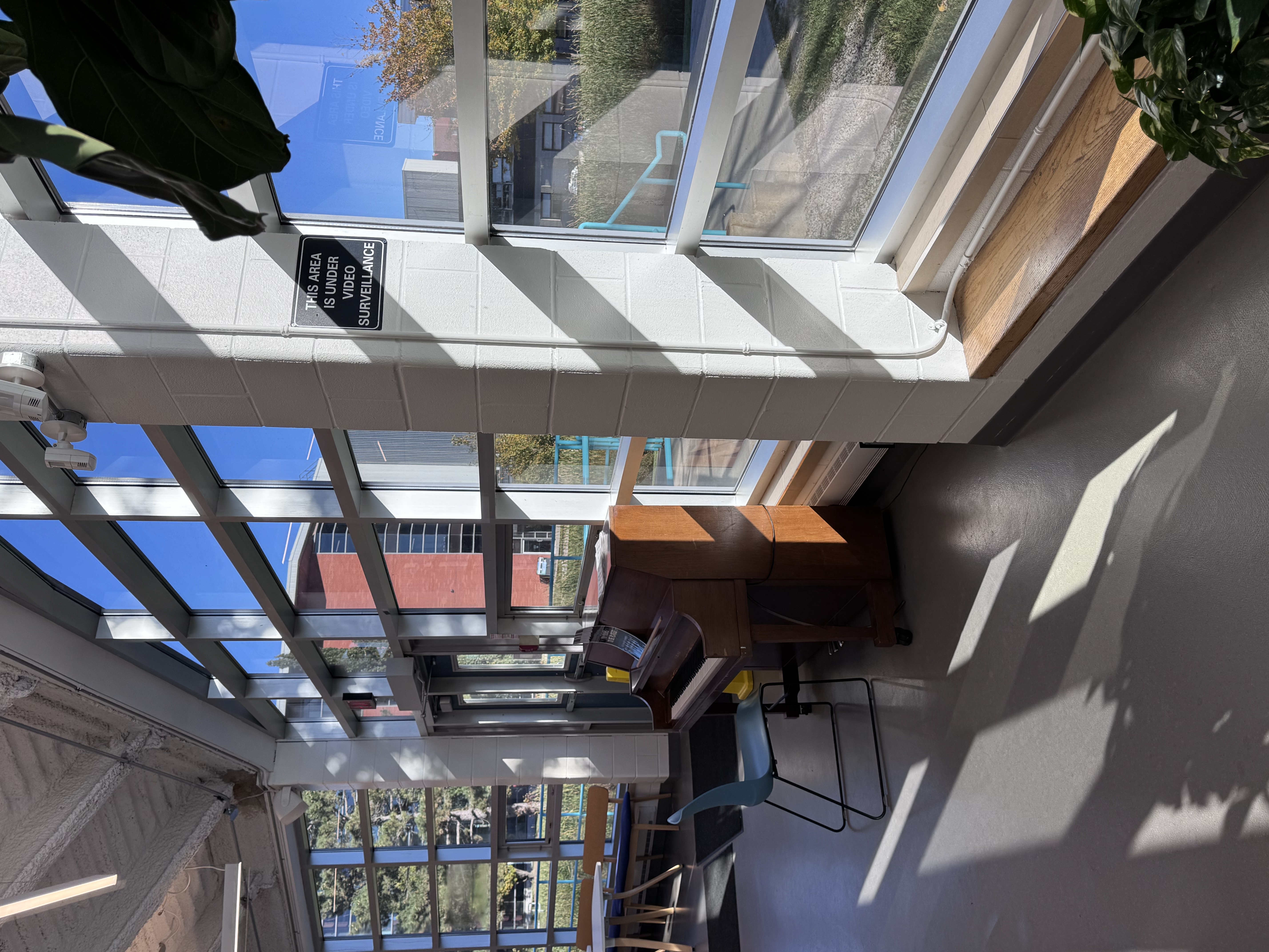
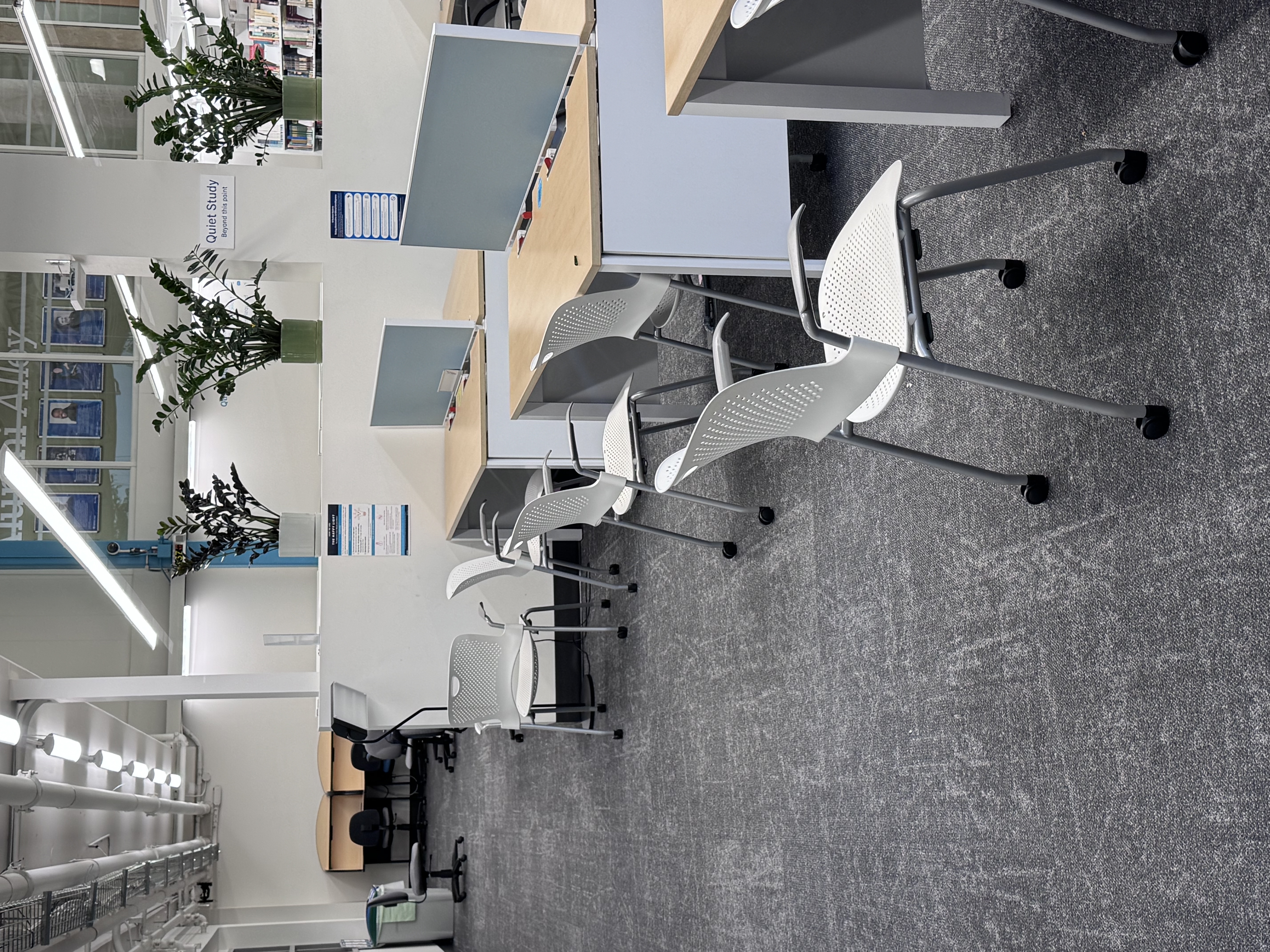
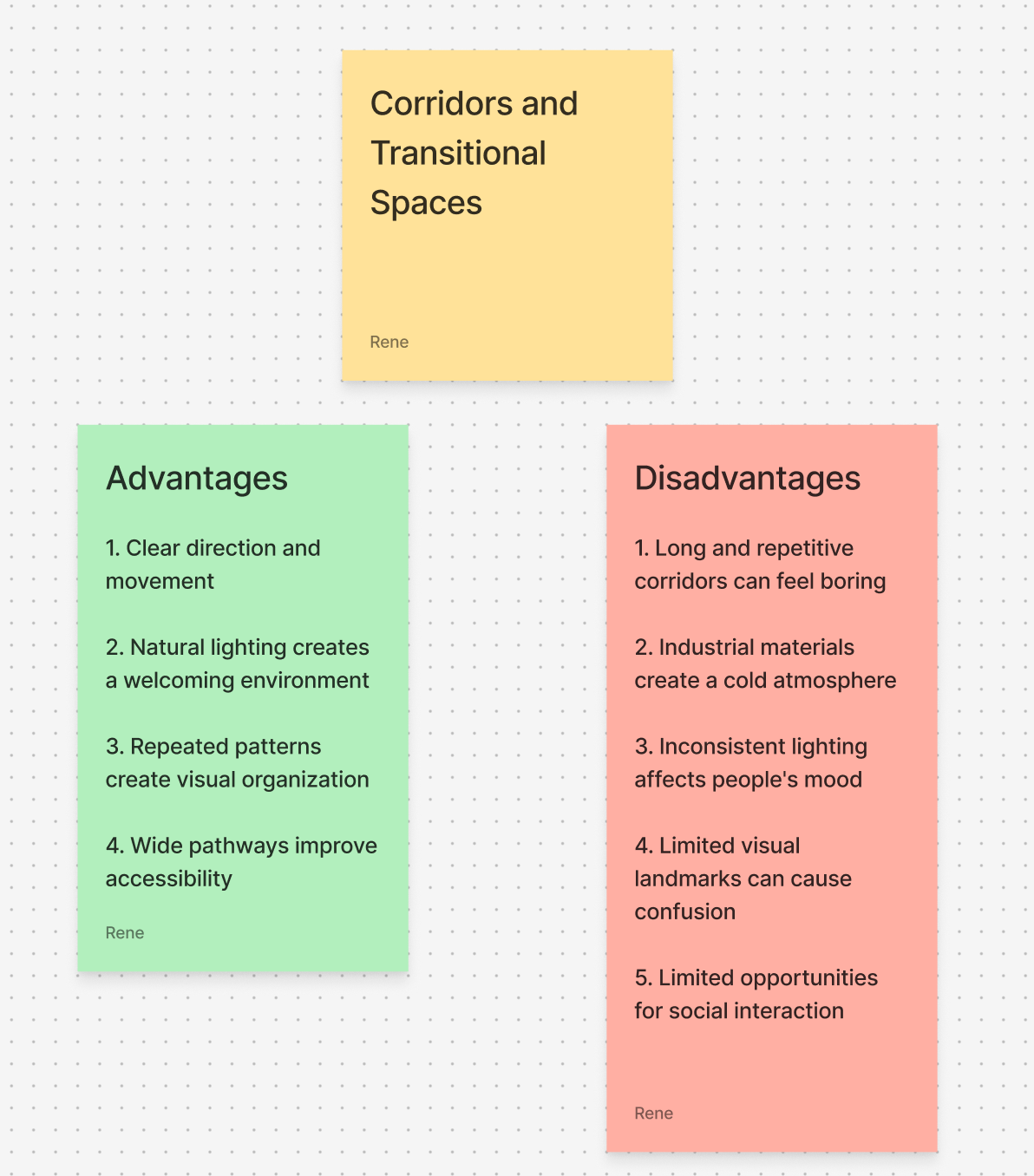
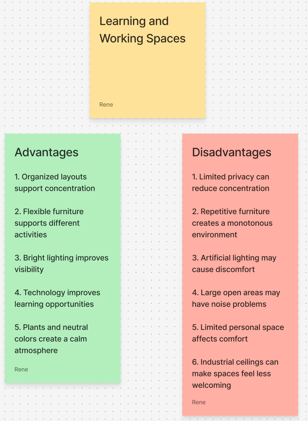
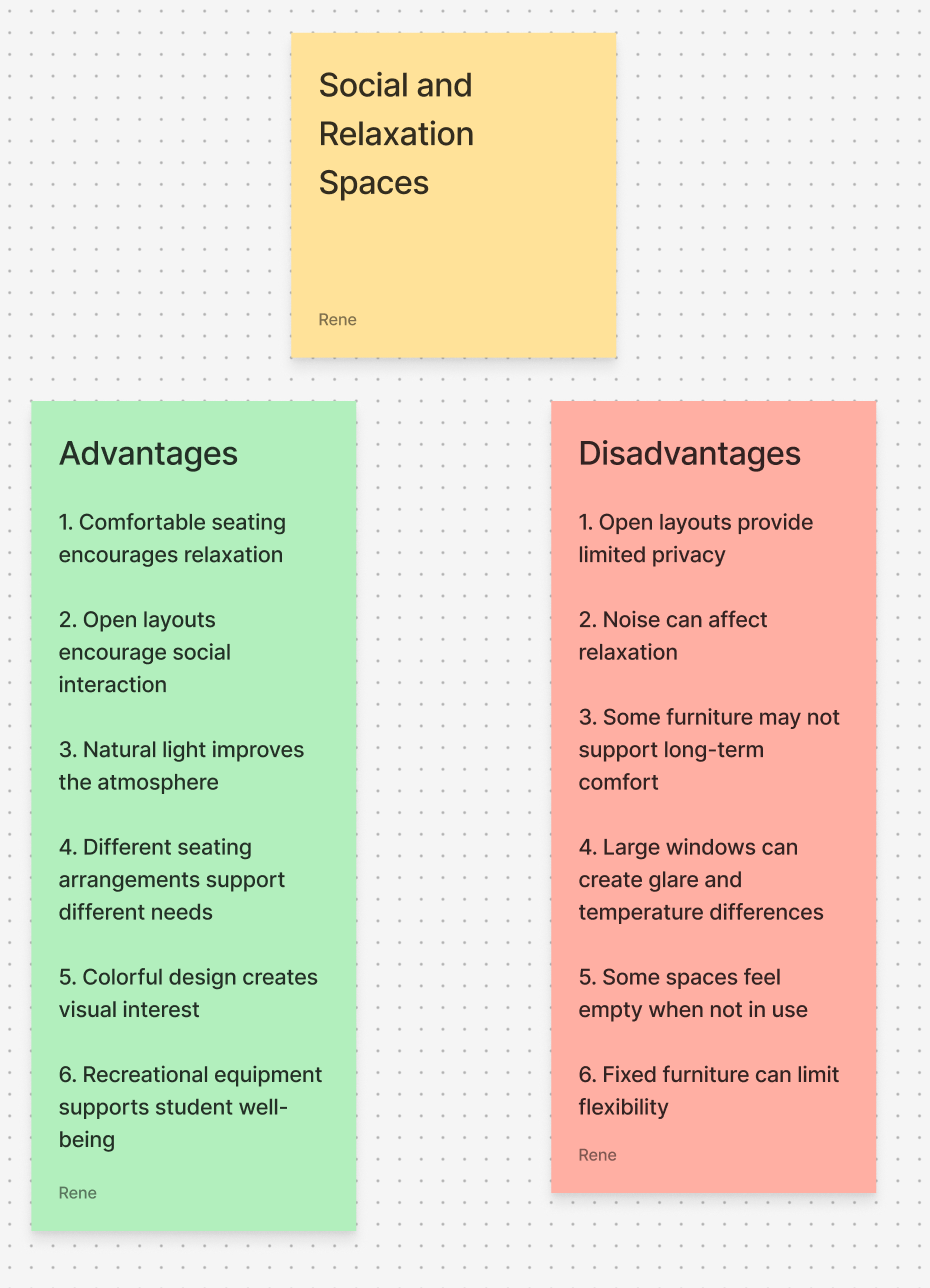
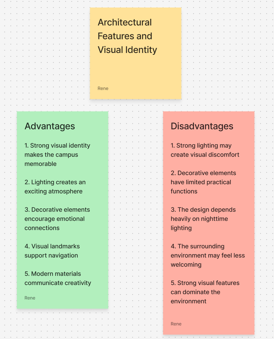
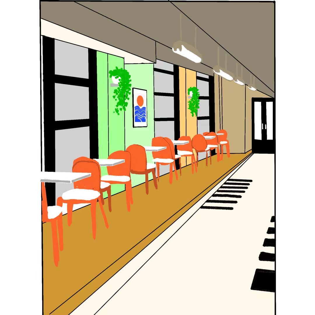
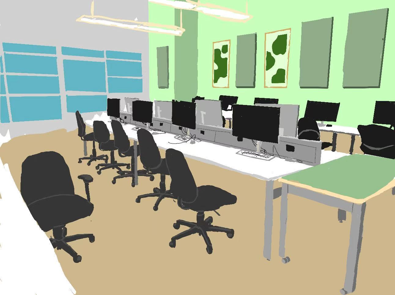
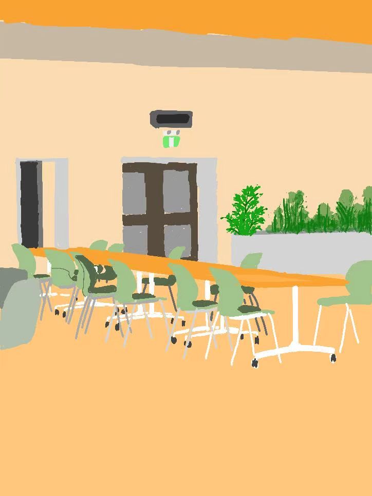
The composition of this picture uses repetition, symmetry, and neutral colours to create an organized and professional atmosphere. The rows of computers and chairs create a sense of balance, while the bright lighting makes the room feel clean and suitable for studying. The simple layout may help people feel focused, productive, and calm. However, the lack of colourful decorations and natural light may make the space feel boring and cold. The closely arranged computers may also reduce privacy and create distractions. Overall, the room feels functional and organized but could benefit from warmer lighting and more creative elements. The composition of this picture uses horizontal lines, exposed pipes, and repeated lighting fixtures to create an industrial and modern atmosphere. The ceiling's organized structure gives people a sense of order and functionality, while the bright white lights make the space feel clean and professional. This design may help students feel focused and productive. However, the exposed pipes and electrical equipment make the ceiling look complicated and crowded. The strong artificial lighting may also cause eye discomfort, and the lack of warm colours makes the space feel cold and less welcoming. The composition of this picture uses a bright orange wall, whiteboards, and a digital screen to create a modern learning environment. The orange colour makes the room feel energetic, creative, and welcoming, while the whiteboards provide space for sharing ideas. The grey walls and acoustic panels balance the bright colours and create a more focused atmosphere. However, the strong orange colour may distract some students during long classes. The exposed ventilation system and crowded equipment in the corner also make the space feel less organized. There is also limited natural light, which may affect people's comfort. The composition of this picture uses a long hallway, concrete walls, exposed pipes, and simple furniture to create an industrial atmosphere. The straight lines guide people's eyes toward the end of the hallway, making the space feel organized and spacious. The benches and tables provide places for students to rest or communicate. However, the grey colours and cold lighting may make people feel bored, lonely, or uncomfortable. The lack of natural light and decoration makes the environment less welcoming. The exposed ceiling equipment also creates a messy appearance, which may affect people's overall experience. The composition of this picture uses repeated chairs, glass panels, and straight lines to create a strong sense of rhythm and order. The symmetrical arrangement makes the space feel organized and balanced. The light colours and simple design may help people feel calm and focused. However, the large empty wall and repeated patterns may make the environment feel boring and lacking in creativity. The chairs are placed high above the ground, which may make some people feel uncomfortable or unsafe. The limited colour variety also makes the space feel less welcoming and interesting. The composition of this picture uses a large glowing blue sculpture, a glass building, and geometric floor patterns to create a modern and creative atmosphere. The bright blue light becomes the main focus and makes the space feel exciting, energetic, and futuristic. The glass walls and visible building structure add a sense of openness. This design may make students feel inspired and connected to the school. However, the strong blue lighting may be uncomfortable for some people, especially at night. The surrounding area is also quite dark, which may make the space feel less welcoming. The composition of this picture uses repeated lockers, straight lines, and neutral colours to create a simple and organized environment. The long row of lockers creates a sense of depth and guides people's eyes toward the end of the hallway. This design may make students feel that the space is practical and orderly. However, the repeated patterns and lack of decoration can make the hallway feel boring and unwelcoming. The grey floor and white lockers create a cold atmosphere, while the limited lighting makes the space feel darker and less comfortable. The composition of this picture uses comfortable sofas, glass railings, and a large digital screen to create a modern resting area. The open space and bright lighting make the environment feel clean and welcoming. The sofas provide students with a place to relax, while the blue wall adds a sense of calmness and creativity. However, the exposed pipes and ceiling equipment make the space feel industrial and less comfortable. The lack of plants and warm decorations may also make the area feel empty. The sofas are arranged in a straight line, which may limit face-to-face communication. The composition of this picture uses a large open space, repeated tables, computers, and bright ceiling lights to create a modern learning environment. The organized furniture and high ceiling make the room feel spacious and professional. This design may help students feel focused and productive, while the shared tables encourage communication and teamwork. However, the grey colours and repeated furniture may make the space feel boring and less creative. The strong artificial lighting may cause eye discomfort, and the lack of plants or colourful decorations makes the environment feel cold and less welcoming. The composition of this picture uses a long hallway, straight lines, and repeated ceiling lights to create a strong sense of depth. The blue sign at the top helps guide people's attention and provides directions. However, the dark hallway and cold colours may make people feel uncomfortable or nervous. The empty space also creates a lonely and quiet atmosphere. Some shortcomings include uneven lighting, a lack of decorations, and poor visibility in the distance. The dark entrance may make the space feel less welcoming, while the overhead sign is partly cut off in the picture. The composition of this picture uses leading lines from the hallway, ramp, and ceiling pipes to create depth and guide people's attention toward the end of the space. The large windows bring in natural light, making the area feel bright, open, and comfortable. The ramp also creates a sense of accessibility and movement. However, the exposed pipes and metal structures make the space feel industrial and less welcoming. The grey floor and plain walls lack warmth and creativity. Some areas also appear crowded because of the large ceiling structures and concrete barriers. The composition of this picture uses the staircase as the main focus, while the large blue information board on the left creates visual balance. The glass railings and high ceiling make the space feel open, bright, and modern. The colourful display adds creativity and makes people feel curious and interested in learning. However, the staircase looks slightly old, which reduces the modern feeling. The large information board contains too much text, making it difficult to read quickly. The plain white walls also make some areas feel empty and less welcoming. The composition of this picture uses repeated tables and chairs to create rhythm and depth, while the long hallway guides people's eyes toward the background. The large windows provide natural light, making the seating area feel bright and relaxing. The colourful columns add energy and make the space more welcoming. However, the exposed ceiling pipes create an industrial feeling that may reduce comfort. The chairs look old-fashioned, and the seating arrangement lacks variety. The raised platform may also create accessibility problems. Overall, the space feels organized but could be more comfortable and modern. The composition of this picture uses the table and chairs as the main focus, while the large window creates a connection between the indoor and outdoor spaces. The natural light and green plants outside make people feel peaceful, relaxed, and comfortable. The view also creates a pleasant environment for studying or taking a break. However, the indoor area looks dark compared to the bright outdoors, creating uneven lighting. The chairs appear uncomfortable for long periods, and the table is quite small. The dark furniture also makes the space feel less welcoming. The composition of this picture uses a large curved seating area as the main focus, while the yellow columns and exposed ceiling pipes create strong vertical and horizontal lines. The blue furniture and wooden floor make the space feel modern, creative, and relaxing. The open layout also encourages students to communicate and socialize. However, the seating looks quite hard and may be uncomfortable for long periods. The exposed pipes make the ceiling feel crowded, while the large empty floor creates a slightly cold atmosphere. The seating arrangement also lacks privacy for students who want to study quietly. The composition of this picture uses long tables and repeated chairs to create a sense of order and balance. The open space, bright lighting, and wooden ceiling make the area feel welcoming and comfortable. The television and game table create a fun and social atmosphere, encouraging students to relax and communicate. However, the large open layout may become noisy and distracting for people who want to study. The hard floor can also increase noise, while the lack of private seating areas reduces comfort. Overall, the space is suitable for social activities but less ideal for quiet studying. The composition of this picture uses large windows, strong geometric lines, and natural sunlight to create a bright and open space. The piano serves as the main focus, while the outdoor view adds a connection to nature. The warm sunlight and wooden furniture make people feel peaceful, comfortable, and creative. This space may encourage students to relax and enjoy music. However, the strong sunlight creates harsh shadows and glare, which may cause discomfort. The seating is limited, and the piano area lacks privacy. The surveillance sign may also make some people feel less relaxed. The composition of this picture uses organized desks, repeated chairs, and straight lines to create a clean and structured study space. The white furniture and grey carpet make the environment feel calm and professional, while the green plants add a natural and relaxing feeling. This design may help students stay focused and feel comfortable while studying. However, the strong artificial lighting may cause eye discomfort, and the limited natural light makes the space feel less welcoming. Also, the open layout and closely placed desks may reduce privacy and create distractions for students. A group analyse on school corridors. A group analyse on school classrooms. A group analyse on school public areas. A group analyse on school unique constructs. In this redesign, I changed the wall color to a soft green to make the corridor feel more relaxing and welcoming. I also added some plants and simple artwork to make the space look less empty and more interesting. I kept the original tables and chairs in the same positions because they already provide a good place for students to sit. These changes make the corridor feel more like a comfortable study and social space instead of just a hallway. For the computer lab, I changed part of the wall to a light blue-green color to make the environment feel calmer and less boring. I also added simple posters on the walls to make the area look more creative. The original computers, desks, and chairs were kept in their positions to maintain the room's function. These changes help create a more comfortable environment where students can focus and feel less stressed. In the student lounge, I used orange and green to make the space feel more energetic and friendly. I also added comfortable sofas and small tables to create a separate relaxing area where students can talk or take a break. Some plants were added to make the space feel less empty. I changed the lighting to a warmer tone to make the environment more comfortable.  Overall, these changes make the lounge more attractive and encourage students to spend time together.

Spatial Workshop 1

put a description here or you will lose grades<a href='https://www.youtube.com/embed/tgbNymZ7vqY' target='_blank'><p>Project Video Link</p></a> put a description here or you will lose grades <div class='container'><iframe class='responsive-iframe' src='https://www.youtube.com/embed/tgbNymZ7vqY'></iframe></div> put a description here or you will lose grades

Spatial Workshop 2

put a description here or you will lose grades <a href='https://www.youtube.com/embed/tgbNymZ7vqY' target='_blank'><p>Project Video Link</p></a> put a description here or you will lose grades <div class='container'><iframe class='responsive-iframe' src='https://www.youtube.com/embed/tgbNymZ7vqY'></iframe></div> put a description here or you will lose grades

Project 2


Final Project 2 Design

PLACEHOLDER TEXT, put a description here or you will lose grades

test2Lorem ipsum dolor sit amet, consectetur adipiscing elit
×

Powered by w3.css